Creating Alternative Navigation Bars

Standard Navigation Bar Configuration

ExtraView comes with a built-in navigation bar which is used for both the standard and workspace interfaces. The theme of the navigation bar is selectable, allowing you to change the graphical style and color of the buttons. Although you may change the theme of the built-in navigation bar, you may not change its functionality. Using the utility described on this page, you may create additional navigation bars for any or all user roles that the administrator has defined and use these to override the built-in navigation bar. The built-in navigation bar appears like the following screen shots, when you have selected the pale blue theme:

Built-in Standard Navigation Bar

Built-in Workspace Navigation Bar

New navigation bars are able to be created for use by one or more user roles in your system. You may define navigation bars that have significantly more entries than the built-in navigation bar, with purpose-built buttons that control access to most ExtraView functions and with access to web pages outside of Extraview. You may also define hierarchical-style navigation bars with sub-menus being available in a traditional menu-style form.

Access to the administration utility is provided with the security permission key named CF_NAV_BAR. Note that the ADMIN user account always uses the inbuilt navigation bar, and never uses a navigation bar that you define. This prevents a situation where you design a navigation bar that inhibits access to the administrative functions, and effectively locks all users out of administration.

The administration utility that allows the definition and modification of different navigation bars is accessed through Admin --> System Configuration --> Navigation Bar. This initially takes you to a screen like this:
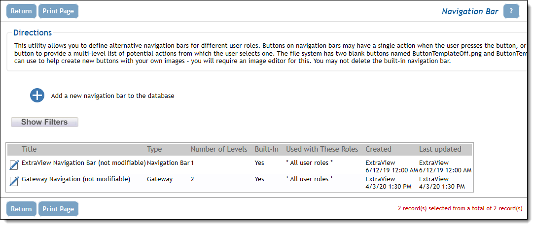
Navigation Bar Administration

The key attributes about designing your own navigation bar are as follows:

  • The default standard navigation bar is named ExtraView Navigation Bar (not modifiable).  On most occasions you will create a new navigation bar, of the type Navigation
  • You may define up to seven sub-menu levels for any navigation bar button, but for usability it is suggested that you do not go to more than three levels deep.
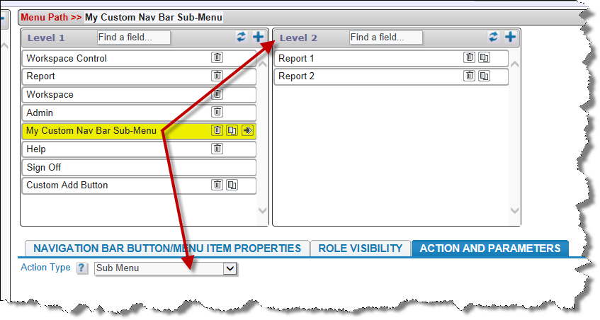
  • Any button on the navigation bar may access a function when it is clicked on by the user, or it may provide a sub-menu when it is clicked. If a sub-menu is selected, the user can click on any entry in that sub-menu to execute a function, or to open up another sub-menu at a lower level.


    Customized Navigation Bar with Sub-Menu
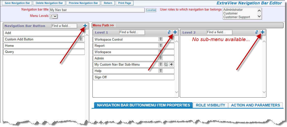
  • Use the NAVIGATION BAR BUTTON/MENU ITEM PROPERTIES tab to define the properties for each navigation button, or each drop-down menu item placed within the individual navigation bar button
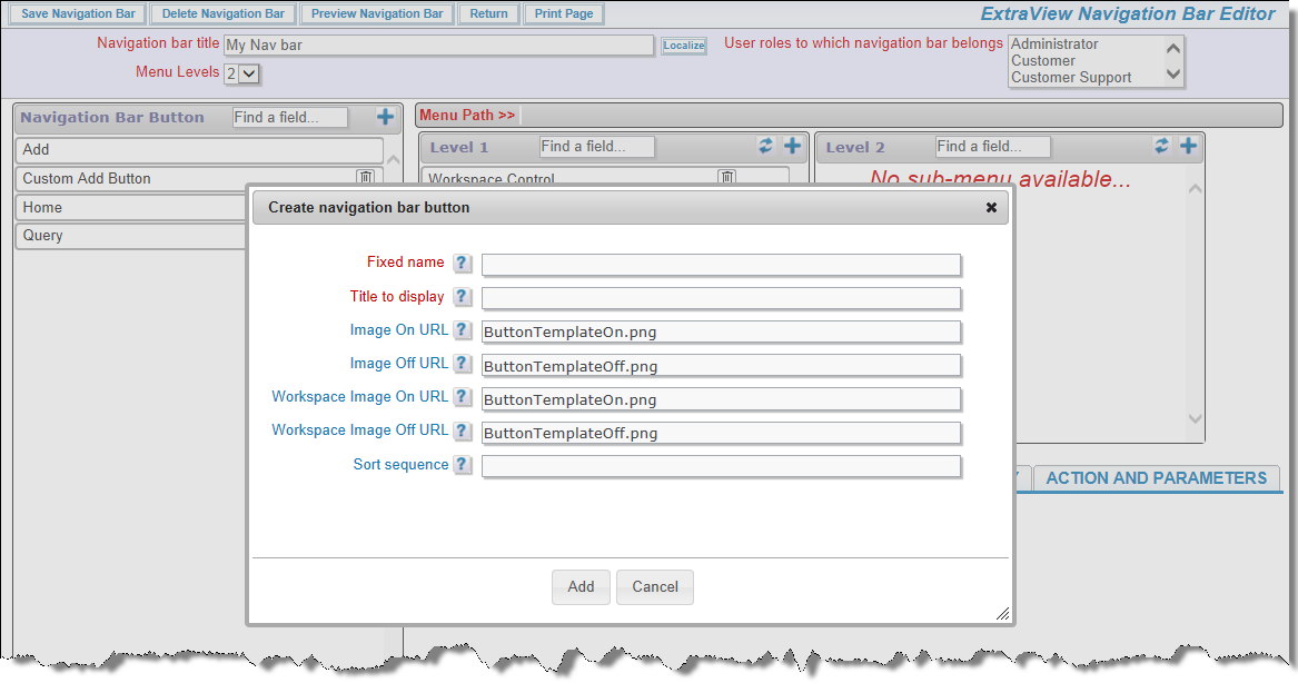
  • Two blank images are provided within the directory structure of the existing buttons, named ButtonTemplateOff.png and ButtonTemplateOn.png. These may be used as placeholders while you are designing your own buttons for the top level of the navigation bar. They are used as the default names for the buttons you create, but you can change these defaults to any name you use for buttons you create.
  • The original Adobe Photoshop files used to create the buttons are provided within the installed directory structure at extraview_installed_directory/locales/en_US/images_nav_bar. You can use Photoshop with the file for your theme, to create matching buttons for each of the themes provided. You can also create your own navigation bar theme from scratch (see here). Note that the navigation bar buttons for all workspace themes are contained in a single file, named nav_bar_workspace.psd.
  • Any button may be designed with any text or graphic on the button itself. The button also has a title which is used when the user places their mouse over the button.
  • Any button you create may be made visible on the standard interface alone, the workspace interface alone, or on both interfaces. You can create new navigation buttons using the appropriate icon on the user interface:


    Adding a New Navigation Bar Button
    Adding a New Navigation Bar Button
  • There are four possible images for each navigation bar button. Two are used on the standard interface, two on the workspace interface. Only two images are needed if you are only using the button on one interface. The buttons are of the "rollover" type, with one image being used when the button is visible, but no mouse over it, and one image being used when the mouse is over the button
  • The navigation bar buttons and sub-menu items may be made visible or invisible for any of the roles to which a navigation bar belongs. You use the ROLE VISIBILITY tab for this
  • Each navigation bar button or sub-menu item has an action type that defines what happens when you click on the button or sub-menu item. The available actions on the ACTION AND PARAMETERS tab are:
    • Sub-Menu: This entry creates a sub-menu where additional actions are defined. Sub-menus may point to further sub-menus, nesting to a maximum of seven levels


      Custom Sub-Menu

    • Open URL: This action allows you to enter any valid URL. A new browser window or tab with the contents of the URL will be opened when the user selects a menu entry with this action
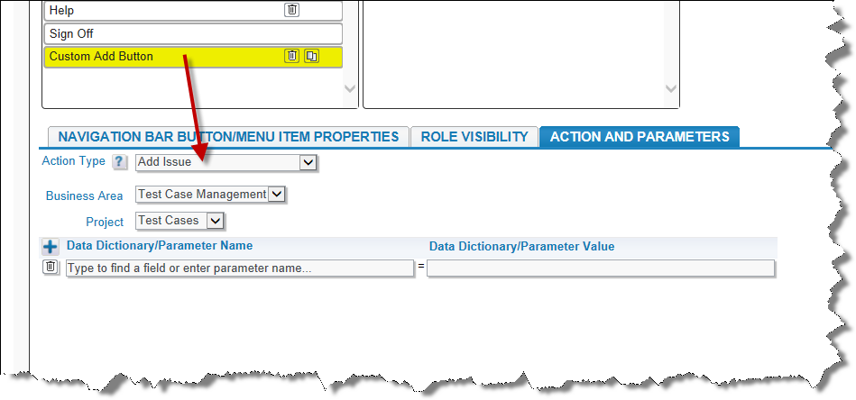
    • Add Issue: This action opens an Add Issue screen or panel within the ExtraView window or workspace. In addition to opening the Add Issue screen, you must select a Business Area and Project for the screen. You also have the ability to choose any number of field names and initial values which will be used to populate the Add Issue screen. As you start to type a name, the utility will pop up a small window with matches for the name you are entering. Typically, you will provide a field name and a value, and these will be used to populate the Add Issue screen when the user presses the button


      Custom Add Button

    • Not all field display types are supported for use with fields that can be used to populate values onto the Add screen. Valid field display types are: Checkbox, Currency, Date, Day, Decimal, List, Number, Pop-up, Radio button, Tab, Text Area, Text Field, and User. There are also restrictions in that the following fields may not be used to populate the screen: ID, PARENT_ID, AREA, PROJECT, ITEM_ID, EV_REPORT_SELECTION, RELATIONSHIP_GROUP_TXNS, NOTIFICATION_HISTORY, ALT_ID, all ATTACHMENT fields, ITEM_ID, MINI_HISTORY, HIST_RANGE_START, and HIST_RANGE_END. In addition to using the fields in your database as actions, you may also use the parameters that are passed to the screen form. In practice, the parameter that may be of most use is to define the name of add_confirm_page with a value of no. This will inhibit the screen from moving to the Add Confirmation screen after adding the issue
    • Run Report: You can select a shared report for the menu, to run when the menu entry is chosen. Note that only shared reports are available for placement on a navigation bar. In addition to the report, you can select the output type and the page size
    • Custom Action: A custom action allows the definition of a user custom JavaScript method to call when the button is pressed by the user. As you would expect, this action must be supported by JavaScript code in the UserCustomJavaScript.js file
    • ExtraView Home: This action purposes the button to open the standard interface Home Page screen when the button is pressed by the user. This action only operates in the standard interface. It has no effect within a workspace interface
    • ExtraView Add: This action opens an Add Issue screen or panel. Unlike the Add Issue action, the screen is opened to the user's current Business Area and Project. This provides the functionality of the standard, in-built Add button
    • ExtraView Query: This action opens the standard, in-built ExtraView Query screen
    • ExtraView Report: This action opens the standard, in-built ExtraView Report screen
    • Open in Edit.  ExtraView supports a mode where new issues are created and inserted into the database before presenting the input screen to the user.  The issue thus has an ID (and perhaps an ALT_ID) before the user sees the screen.  This action allows a new issue to be created and for the screen to be opened to the user in edit mode
    • ExtraView Workspace: This action opens the default standard, in-built Workspace for the user. This action is only operable on the standard interface
    • ExtraView Admin: This action places the button that accesses the standard, in-built Administration screens on the navigation bar
    • ExtraView Help: This action places the button that accesses the standard, in-built Help screen on the navigation bar
    • ExtraView Sign Off: This action places the button that operates the standard, in-built Sign Off button on the navigation bar. You should always place this button on the top-level menu
    • ExtraView Workspace Menu: This action is only operable within a workspace. It places the standard, in-built Workspace menu on the navigation bar.
  • You should always place a Sign Off button on navigation bars that you design. It is also recommended that you place a Home Page button on the standard interface navigation bar and a Workspace menu button on the workspace navigation bar

Triggering Rules from a Navigation Bar

This technique only works with Add buttons on navigation bars. You can trigger a rule action using a business rule similar to this:

if (SCREEN_NAME = 'ADD' && MY_ADD_NAV_BUTTON= 'Add Task' ) {
  PRIORITY = 'P 2';   CATEGORY = 'Task';
}

If the user chooses the Add Task navigation bar item, then the PRIORITY and CATEGORY fields are set as shown above.

Tips to Create a Navigation Bar

  • When you first create a new navigation bar, use the multi-select list with the title User roles to which navigation bar belongs to select all the user roles with which you want to use the navigation bar
  • You have control over which buttons within the navigation bar appear for each of the selected user roles selected using the Role Visibility tab within each entry on the menu. Thus, you can define a navigation bar for all or many roles, with all the buttons you require, and then use the Role Visibility checkboxes to turn individual entries off and on for each role
  • You also have control over which buttons appear within the standard user interface and within the workspace interface using the Display mode selector within the properties
  • The built-in ExtraView navigation bar uses the MENU_XXX security permission keys to control visibility. For example, MENU_ADD_PROBLEM controls the Add button on the built-in navigation bar
  • When you create your own navigation bar, the MENU_XXX permission keys are used for built-in buttons and permission keys named MENU.XXX are made available for your own user-defined buttons. For example, when you add built-in buttons named MY_REPORT_NAV, MY_QUERY_NAV, and MY_ADMIN_NAV to your navigation bar, you will have the following permission keys available, to control the button role visibility:You can control the permission to your buttons either through the utility documented on this page, or via the Grant Security Privileges administration utility.
    • MENU.MY_REPORT_NAV
    • MENU.MY_REPORT_NAV
    • MENU.MY_ADMIN_NAV
  • If you use the Sort sequence to reorder a list, use the Refresh button to re-display the menu
  • When designing a navigation bar, you can use the Preview Navigation Bar menu bar button to check exactly what will be seen for any user role and for both the standard user interface and the workspace interface. Here is an example:

    Preview Mode

  • Plan your new navigation bar from the top level downwards, and have a graphic designer use Photoshop to create the new buttons before completing the configuration of the navigation bar.

Click here for end user documentation