Choose a User Interface Theme
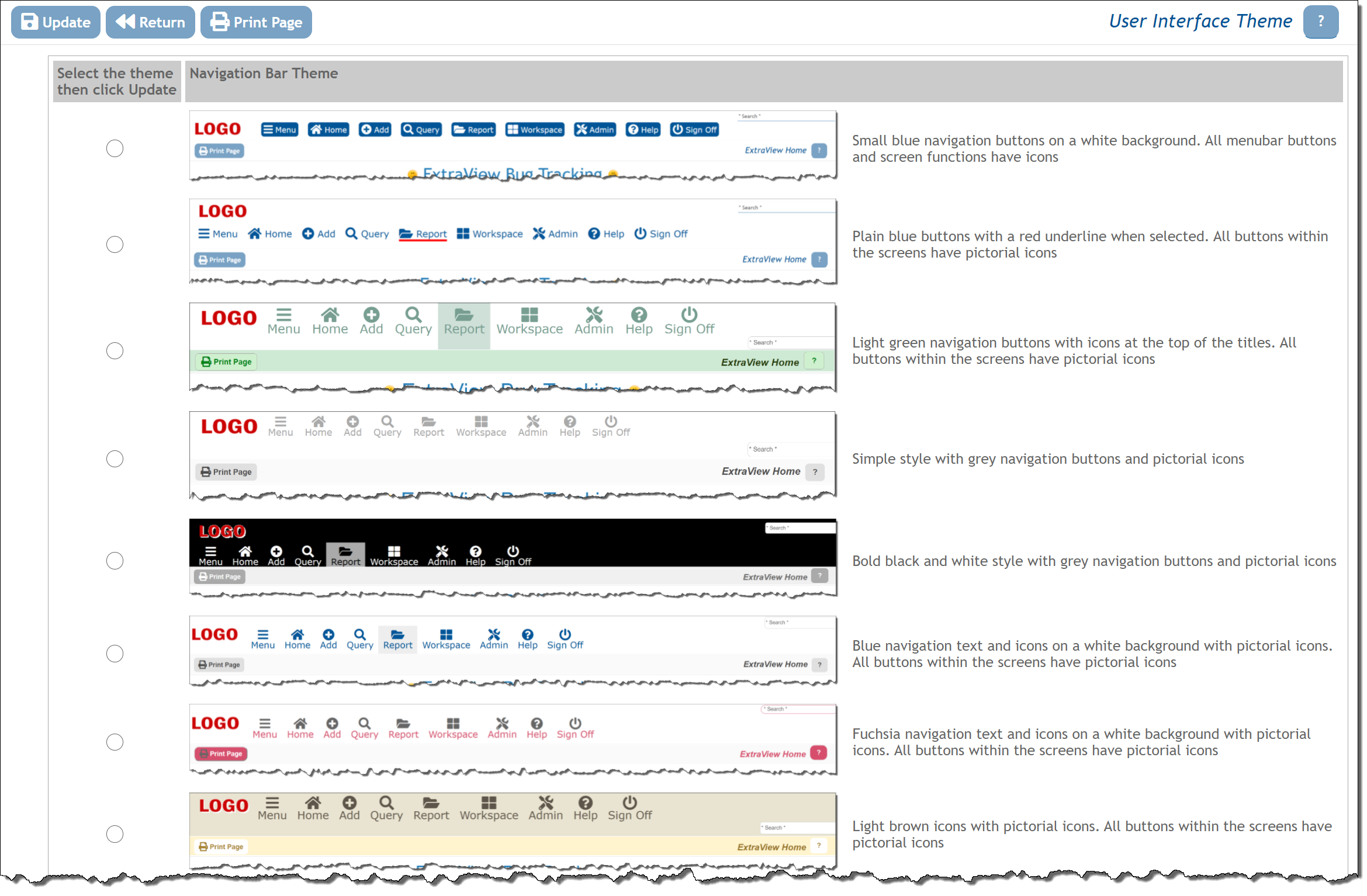
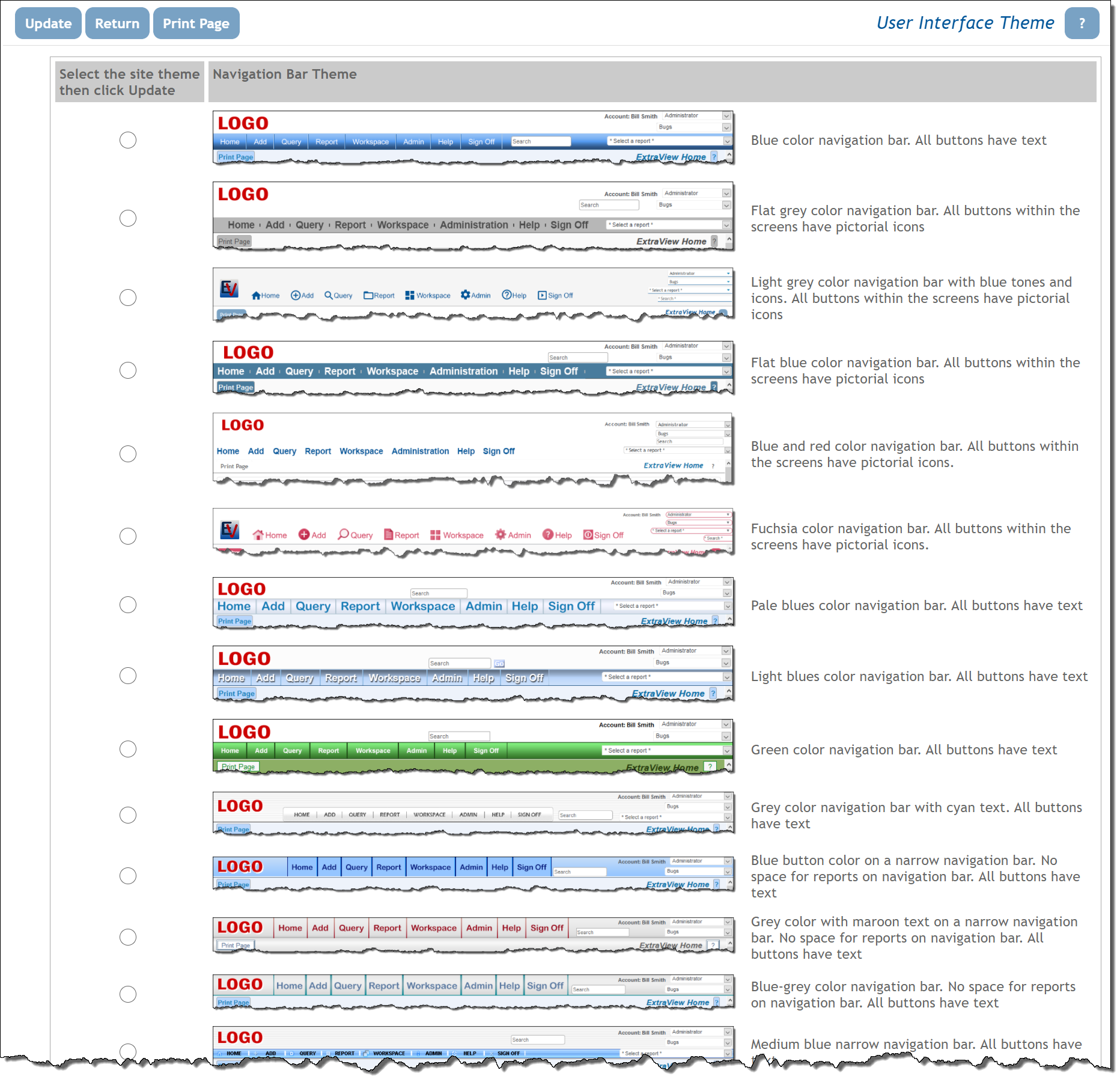
This administrative function provides a means to set the overall theme of the screens displayed to users. Select User Interface Themes from the Administration –> Initial Setup menu. The screen displayed is a little different, dependent on whether you are using STYLEs or IMAGEs for your navigation bar buttons. This selection is made using the behavior setting named NAV_BAR_DISPLAY. Using a value of STYLE is more flexible and offers the ability to preceisely set a design for your navigation bar buttons without the need to design custom images if you have custom buttons on your navigation bar. You may also choose an icon for the button from a large library. There are a number of preset themes for both the STYLE and IMAGE interfaces. The STYLE interface is also easier to customize to precise colors that may match your company logo on the navigation bar.
STYLE Navigation Bar Button Setting
This uses HTML images and CSS to compose the buttons. This is extremely flexible interface and easier to customize than using IMAGEs.

- Select the user interface theme which you prefer
- Click the Update button on the menubar of the screen
- You will be prompted to sign off and sign on again to view the theme you selected
- You can repeat this step as often as needed to try out the various themes
When in a workspace, an entirely different navigation bar is displayed. This is colored to be in tone with the selection you make for the navigation bar.
With any of the themes you select, you can further customize the look and feel of the navigation bar buttons as explained on the following pages.
IMAGE Navigation Bar Buttons Setting
Image files are used to compose the navigation bar buttons. Two buttons are required for each button, one for the “off” state and one for when the user passes their mouse over the button. Buttons are typically composed with a grpahics application such as Adobe Photoshop.

- Select the user interface theme which you prefer
- Click the Update button on the menubar of the screen
- You will be prompted to sign off and sign on again to view the theme you selected
- You can repeat this step as often as needed to try out the various themes
The buttons on the menubars will always be displayed with words, as opposed to icons, and the options vary from screen to screen.
When in a workspace, an entirely different navigation bar is displayed. This is colored to be in tone with the selection you make for the navigation bar.
It is possible to have a completely different theme for the site, for example using an existing company style that you have in other applications. Instructions to create this are here. You may also contact ExtraView support for assistance in configuring a different theme.
With any of the themes you select, you can further customize the look and feel of the navigation bar buttons as explained on the following pages.
