Navigation Buttons with Images
If ExtraView Corporation is hosting your installation, you do not have direct access to the file system of the server to configure, alter or use this feature without contacting ExtraView support.
Using images as your navigation bar buttons is enabled with the behavior setting NAV_BAR_DISPLAY set to a value of IMAGE.
Navigation and action buttons within ExtraView are created and stored as png files. They reside in two images directories, which are defined by the paths in the IMG_HOME and the IMG_NAV_BAR_HOME behavior settings. The IMG_NAV_BAR_HOME setting contains all the images required by the standard interface navigation bar. There is a sub-directory of this directory, named workspace, which contains a set of images with the same name, but used for the Workspace interface. The remaining images are stored in IMG_HOME. Any image can be replaced with an alternative or you may create a new directory and place a complete set of images within the new directory. You then define the path to the new directory in the IMG_HOME and / or the IMG_NAV_BAR_HOME behavior settings. Care should be taken not to provide images that are too large, and cause your browser to display them with unsatisfactory results. The following table shows the standard images that can be altered by the user, and their suggested size (width x height).
Note that the file named CompanyLogo.gif does not reside within the IMG_HOME or the IMG_NAV_BAR_HOME location, but sits directly under the directory named /images. This allows your company logo to sit in one place, but be accessible to any set of issues you select. Also note that there is an administrative function that allows you to upload the file CompanyLogo.gif, without needing access to the file system of the server.
If you want to create your own navigation bar image buttons, the original Adobe Photoshop files used to create the buttons for all themes are provided in the installed ExtraView directory, at extraview_installed_directory/web/en_US/images_nav_bar. Note that the navigation bar buttons for all workspace themes are stored in a single file named nav_bar_workspace.psd.
Navigation Bar Images in the IMG_NAV_BAR_HOME Directory
Note again that under this directory is a directory named workspace, which is where the navigation bar buttons for the workspace reside. Navigation bar buttons within the workspace are recommended to have a size of 60 pixels wide, by 40 pixels high.
| Sample Image | Filename | Size | Purpose |
 |
bHomeOff.png | V=100×25 H=80 x 30 | The off state for the homepage button |
 |
bHomeOn.png | V=100×25 H=80 x 30 | The on state for the homepage button |
 |
bSystemConfigOff.png | V=100×25 H=80 x 30 | The off state for the administration button |
 |
bSystemConfigOn.png | V=100×25 H=80 x 30 | The on state for the administration button |
 |
bAddProblemOff.png | V=100×25 H=80 x 30 | The off state for the add issue button |
 |
bAddProblemOn.png | V=100×25 H=80 x 30 | The on state for the add issue button |
 |
bSearchOff.png | V=100×25 H=80 x 30 | The off state for the search/report button |
 |
bSearchOn.png | V=100×25 H=80 x 30 | The on state for the search/report button |
 |
bHelpOff.png | V=100×25 H=80 x 30 | The off state for the help button |
 |
bHelpOn.png | V=100×25 H=80 x 30 | The on state for the help button |
 |
bLogoffOff.png | V=100×25 H=80 x 30 | The off state of the sign off button |
 |
BannerBackground.png | V=any reasonable size x 85 H=130 x any reasonable size | Image background for the main menu |
 |
ExtraViewLogo.gif | V=any reasonable size x 37 H=100 x any reasonable size | The ExtraView logo that appears on the navigation bar |
 |
GoButton.png | V=any reasonable size x 37 H=100 x any reasonable size | Optional button displayed by the drilldown box on the navigation bar |
Other Images in the IMG_HOME Directory
| Sample Image | Filename | Size | Purpose |
 |
AddButton.png | 40 x 20 | This is a general use add button used throughout |
 |
DescButton.png | 40 x 20 | Used to access the metadata for file attachments |
 |
DeleteButton.png | 40 x 20 | The delete button on the layout editor screen or on a report |
 |
DeleteButtonWide.png | 60 x 20 | The delete button on the layout editor screen or on a report |
 |
DnDButton.png | 40 x 20 | Used as a handle for drag objects |
 |
EditButton.png | 40 x 20 | This is a general use edit button used throughout |
 |
HideCategories.png | 137 x 20 | Used within administration screen lists |
 |
HideFilters.png | 137 x 20 | Used within administration screen lists |
 |
HistoryButton.png | 40 x 20 | Used to access History from a report |
 |
InsertButton.png | 40 x 20 | The insert button on the layout editor screen |
 |
ListButton.png | 40 x 20 | This is a general purpose list button |
 |
MapButton.png | 40 x 20 | Used in the import functions |
 |
QuickEditButton.png | 40 x 20 | Used to access the Quickedit mode |
 |
RemoveButton.png | 60 x 20 | Used to remove issues from relationship groups |
 |
SaveButton.png | 40 x 20 | General purpose |
 |
SetGUITheme.png | 60 x 20 | Used to set the theme within administration |
 |
ShowCategories.png | 137 x 20 | Used within administration screen lists |
 |
ShowFilters.png | 137 x 20 | Used within administration screen lists |
 |
UpdateButton.png | 40 x 20 | Update button in metadata screens |
 |
UploadButton.png | 60 x 20 | Used to upload files |
 |
ViewButton.png | 40 x 20 | The button used to view a detailed report |
 |
NextButton.png | 18 x 18 | The button used to select the next page of a report |
 |
PreviousButton.png | 18 x 18 | The button used to select the previous page of a report |
 |
Calendar.png | 19 x 18 | Button used to access the calendar |
 |
ColorPicker.png | 19 x 18 | Used to indicate the color-picker popup |
 |
LinkButton.png | 19 x 18 | The button used to provide on-screen links to other functions |
 |
PermissionsButton.png | 19 x 18 | Provides access to security permissions |
 |
QmarkButton.png | 19 x 18 | Button used to access a pop-up list of users |
 |
timerOff.png | 19 x 18 | Used for the timer field |
 |
timerOn.png | 19 x 18 | Used for the timer field |
 |
Style.png | 19 x 18 | Access to the style of an object |
|
|
AgingIcon.gif | 19 x 18 | Icon used to signify a report is an aging report |
|
|
ChartIcon.gif | 15 x 15 | Icon used to signify a report is a chart |
|
|
ContainerIcon.gif | 15 x 15 | Icon used to signify a report is a container report |
|
|
ExternalReportIcon.gif | 15 x 15 | Icon used to signify a report is an external report |
|
|
MatrixIcon.gif | 15 x 15 | Icon used to signify a report is a matrix report |
|
|
PageLayoutIcon.gif | 15 x 15 | Icon used to signify a report is a layout |
|
|
ReportIcon.gif | 15 x 15 | Icon used to signify a report is a columnar report |
|
|
StatisticsReportIcon.gif | 15 x 15 | Icon used to signify a report is a statistics report |
|
|
SummaryIcon.gif | 15 x 15 | Icon used to signify a report is a summary report |
|
|
AgingIconBig.gif | 19 x 19 | Icon used to signify a report is an aging report |
|
|
ChartIconBig.gif | 19 x 19 | Icon used to signify a report is a chart |
|
|
ContainerIconBig.gif | 19 x 19 | Icon used to signify a report is a container report |
|
|
ExternalReportIconBig.gif | 19 x 19 | Icon used to signify a report is an external report |
|
|
MatrixIconBig.gif | 19 x 19 | Icon used to signify a report is a matrix report |
|
|
PageLayoutIconBig.gif | 19 x 19 | Icon used to signify a report is a layout |
|
|
ReportIconBig.gif | 19 x 19 | Icon used to signify a report is a columnar report |
|
|
StatisticsReportIconBig.gif | 19 x 19 | Icon used to signify a report is a statistics report |
|
|
SummaryIconBig.gif | 19 x 19 | Icon used to signify a report is a summary report |
 |
GrowButton.png | 10 x 10 | Button used to enlarge a text area when editing |
 |
ShrinkButton.png | 10 x 10 | Button used to reduce the size of a text area when editing |
 |
smallbullet.gif | 10 x 10 | General purpose small button |
 |
ArrowSelectOff.png | 12 x 12 | Icon used to signify report columns that can be sorted |
 |
ArrowSelectOn.png | 12 x 12 | Icon used to show the column currently used as the descending sort key for a report |
 |
B0.gif…B9.png | 20 x 20 | Ten Separate gifs with the numerals 0 to 9, used in many places |
 |
Arrow.gif | 11 x 9 | Used on the menubar to indicate entries with sub-menus |
 |
promote.gif | 15 x 15 | Used in reports to indicate a group heading that may be promoted |
 |
SelectorOff.gif | 15 x 15 | Used as the off indicator for the record selector |
 |
SelectorOn.gif | 15 x 15 | Used as the on indicator for the record selector |
 |
SortAscend.gif | 15 x 15 | Used to indicate ascending sort |
 |
SortDescend.gif | 15 x 15 | Used to indicate descending sort |
 |
TreeAddButton.gif | 40 x 15 | Tree button to add elements |
 |
TreeEditButton.png | 40 x 15 | Tree button to edit elements |
 |
TreeDeleteButton.png | 40 x 15 | Tree button to delete elements |
 |
TreeViewButton.png | 40 x 15 | Tree button to view elements |
 |
TreeOptInButton.png | 40 x 15 | Tree button to opt-in |
 |
TreeOptOutButton.png | 40 x 15 | Tree button to opt-out |
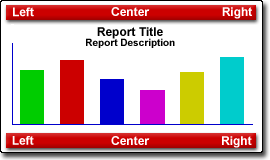 |
ChartLayout.gif | 270 x 160 | Part of PDF preparation |
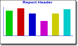 |
GroupChartPic.gif | 270 x 160 | Part of PDF preparation |
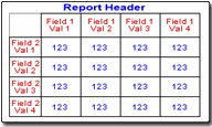 |
GroupColDGPic.gif | 270 x 160 | Part of PDF preparation |
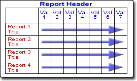 |
GroupColPic.gif | 270 x 160 | Part of PDF preparation |
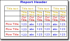 |
GroupColReportPic.gif | 270 x 160 | Part of PDF preparation |
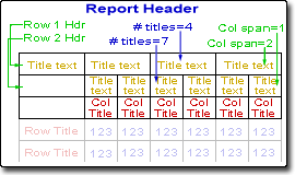 |
GroupHeadersPic.gif | 270 x 160 | Part of PDF preparation |
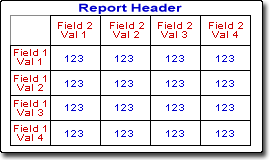 |
GroupRowDGBPic.gif | 270 x 160 | Part of PDF preparation |
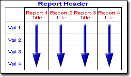 |
GroupRowPic.gif | 270 x 160 | Part of PDF preparation |
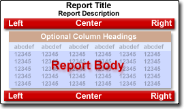 |
ReportLayout.gif | 270 x 160 | Part of PDF preparation |
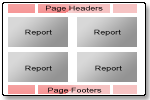 |
ReportContainer.gif | 150 x 100 | Depicts containter report layout |
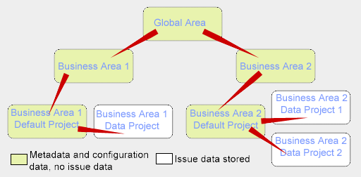 |
AreaProjectFlow.gif | 500 x 250 | Exemplifies the Area / Project structure |
 |
TransitionArrow.gif | 30 x 20 | Used as part of the Status Transition diagram |
 |
TransitionArrow.gif | 20 x 20 | Used as part of the Status Transition diagram |
