Button Fields
Inbuilt Button Fields
These fields are part of every installation and predefined for use.
| Field Name | Title | Definition |
| DELETE_BUTTON | Delete Button | The item delete button. Access to the security permissions for this button allow users to delete issues |
| EDIT_BUTTON | Edit Button | The drill down edit button used on reports and within email |
| HISTORY_BUTTON | History Button | The button that accesses history from the edit screen or reports |
| QUICKEDIT_BUTTON | Quickedit Button | The button that accesses the Quickedit mode from column reports and Quicklists |
| VIEW_BUTTON | View Button | The drill down button that allows you to see the detailed report for an issue |
| SAVE_BUTTON | Save Button | This button is used on attachment layouts, allowing users to save rather than view attachments |
User Defined Button Fields
Button fields should be created within the LABELS / BUTTONS tab within the data dictionary. Click the button by the prompt Add a new field to the database to create a new button field. Provide a Fixed name and Title to display. The Display type should be Button. Buttons may be created for a variety of purposes and with a variety of styles.
- Icon. You can browse the icon library and select a suitable icon to place on the button. There are around 6,000 icons to choose from
- Icon Display. Choose by selecting to display only text on the button, only the icon or both an icon and text
- Action Type. The available actions cover using the buttons to execute internal standard ExtraView functions as well as creating custom actions specifically for your installation:
- Report Trigger. These may be placed on Column and Treegrid reports. They require a preupdate Business Rule to be defined with the action to be performed when the button is clicked by the user. For example, this rule will be executed when the button is clicked:
<== preupdate ==>

if (MY_BUTTON.{changed}) {

ASSIGNED_TO = 'BSMITH';

STATUS = 'Open';

} - Button Action. These buttons are placed as global cell attributes on RID PREHEADER ADD BUTTONs. The button provides the required information to perform the drilldown actions taken when a user clicks the button.
- Open URL. This action allows you to define an Open URL button that is placed on a navigation bar. When the button is clicked, it will open a new browser window at the destination URL
- Run Report. This button action allows a specific report to be run when it is clicked. You may also select the output type and the page size
- My Favorite Reports. This configuration allows the button to display a list of the current user’s favorite report list. The user can click on any report to run it
- Custom Action. These buttons allow the administrator to execute custom code when a button on the navigation bar is clicked. The custom code must exist or an error will occur. The custom code should log any errors and exceptions to the application server log
- Add Issue. This requires that you provide the Business Area and Project, to define the add screen that will be used
- Open in Edit. This is similar to the Add Issue button action, except that the issue is created immediately and the edit screen is opened for the user
- ExtraView Query. This button action opens the inbuilt ExtraView Query screen
- ExtraView Report. This button action opens the inbuilt ExtraView Report screen
- ExtraView Workspace. This button action opens the inbuilt ExtraView Workspace screen
- ExtraView Admin. This button action opens the inbuilt ExtraView Admin screen
- ExtraView Sign Off. This button action sign off the user from their current session
- ExtraView Clone. This button action clones the current issue. This only works on an edit screen
- ExtraView Close. This button action closes the currently open issue
- ExtraView Delete. This button action deletes the currently open issue within an add or edit screen. It may also be placed on a row of a column or treegrid report
- ExtraView Email. This button action opens the inbuilt ExtraView ad-hoc email screen from an add or edit screen
- ExtraView File Upload. This button action opens the inbuilt File Upload screen from within an add or edit screen
- ExtraView History. This button action opens the inbuilt ExtraView History screen. Again this only works on an edit screen
- ExtraView Insert & Continue. This button action works on an add screen. When clicked the current issue is saved and the screen is reopened
- ExtraView Print Page. This button action sends the current screen to the printer
- ExtraView Refresh. This button action refreshes the current screen
- ExtraView Related Issue Display. This action button is only available on Related Issue Displays. It places a button on each row of a search layout of a RID that is used to link the issue to the parent
- ExtraView Submit. This button action submits the current issue from an add or edit screen
- ExtraView Update & Prev. This button action assumes the user has drilled into an edit screen from a report. When clicked it will open the previous issue within the calling report
- ExtraView Update. This button updates the issue when clicked from an edit screen
- ExtraView Update & Continue. This button action assumes the user has drilled into an edit screen from a report. When clicked it will update the current issue and continue within the current screen and issue
- ExtraView Update & Next. This button action assumes the user has drilled into an edit screen from a report. When clicked it will open the next issue from within the calling report
- Report Trigger. These may be placed on Column and Treegrid reports. They require a preupdate Business Rule to be defined with the action to be performed when the button is clicked by the user. For example, this rule will be executed when the button is clicked:
- Display Text. This is only used when creating Label fields. Ignore for Button fields
- Help Text. This is the help tip with will be displayed when the user mouses over the field.
Advanced Styling of Buttons
Buttons initially take on the same style as all other buttons defined within the user interface theme that has been selected. In this way they have identical coloring and size as built-in buttons. For some purposes you may want to alter the style of these buttons, perhaps just the color to differentiate its purpose on a screen. You may also want to design radically different buttons, such as those you may want to use as shortcuts on user’s Home Pages.
You can achieve styling the buttons from within the Data Dictionary by editing the button field or by right-clicking on the button within the Design Center, and clicking the Edit Field option. This takes you to the editor screen for the field. Styling is achieved by adding a GLOBAL ATTRIBUTE to the field. Click this tab and then Create a new attribute.
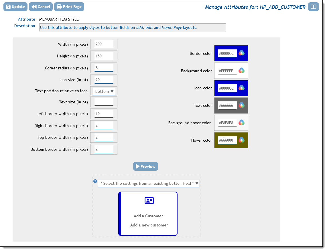
Choose the option for the attribute STYLE or STYLE_ADV and you can complete the styling in the popup. STYLE_ADV allows you to set the style depending on logical criteria that you define, based on the values of fields within the form. An example of the setting the style in the popup may look like the result you see when you click the Preview button as shown here:

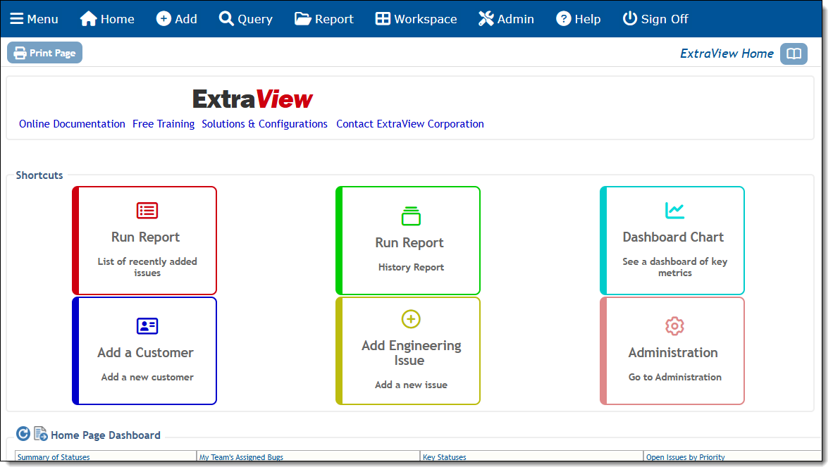
When creating several buttons for a Home Page layout, it’s likely that you will want to style them similarly, but use color as a differentiator. To avoid the tedium of creating the style for each button separately, you can click the * Select the settings from an existing button field * and select a button with the style you want to emulate. You can the either save this style or modify it to you liking, For example, you might want to alter border and icon color, but leave the size and other attributes. The above settings were used to produce this Home Page when the layout styles were applied:

Legacy Buttons
Historically, before version 20.0, button fields were created as UDF fields with a specially formatted name and with a Custom display type. The Help Text was used to create the label text for the button. Whilst this method is maintained for backwards compatibility it is now recommended that you create a native type button field as described above. The historic method of button creation allowed you to create and place a button with any label of your choosing on an add or edit screen by defining a field with a display type of Custom in the data dictionary, with its name beginning with the characters BUTTON_ or ending with the characters _BTN. Placing this field on an add or edit screen layout results in a button being generated on the screen, when you place the field on a layout. Note that when you create a button field in this manner, a global attribute named CONFIRM_STANDARDS is added to its data dictionary entry. This does not need to be altered in any way by the administrator.
The following are used to define these historic buttons:
| Data dictionary field | Purpose |
| Name | This defines the name of the field. For example, a button named BUTTON_GENERATE is valid. |
| Display Type | Must be Custom |
| Title | Typically this is a space character |
| Help Text | This will become the text on the button |
To provide the action for the button, place a layout cell attribute of type FIELD HTML MODIFIER within the layout upon which you place the button. There are three primary ways you can provide an action for this button:
- If you want to open a new window where you can add a different issue, your FIELD HTML MODIFIER may look like this:
onclick=window.open(“evSignon?p_action=doAddDisplay&p_option=Display&p_close_win=true&ev_menu=off&p_area=7&p_project=9”)
The parameters for the Area and Project use their respective IDs. Note that the URL does not need to reside within ExtraView and your action might open up a web address anywhere. See the API Guide for more information.
- Your button may execute business rules. As an example, you might want to add a new issue directly into the database, using values from the current issue. When pressing your button executes an
onchangebusiness rule, ExtraView will execute the necessaryonclickaction to initiate the action.In versions of ExtraView prior to 10.0, you may have added a JavaScript function via the HTML_MODIFIER attribute, such as:onclick='javascript:;userSubmitChangeAjax(this.name)';This is no longer required for the functionality to work. If you have such a HTML_MODIFIER, it will adversely effect the smooth functioning of the ExtraView code by introducing unnecessary screen refreshes. Therefore, remove the HTML_MODIFIER if it exists from a previous version
- Create your business rules. This example shows how you might add an issue into a different business area, while copying over some of the field values from the current issue. It is based upon your button field name being BUTTON_CREATE_TEST_CASE:
if (BUTTON_CREATE_TEST_CASE.{changed}) {
ADD :
AREA = ‘Test Case Management’;
TEST_CASE_STATUS = ‘New’;
PROCEDURE = TEST_INSTRUCTIONS;
MODULE_ID = MODULE_ID;
ASSIGNED_TO = ‘{null}’;
CREATED_FROM_BUG_ID = ID;
COMMENTS = DESCRIPTION;
} - You can provide an action for the button by implementing custom code within the method named ucRenderEmbeddedObject. The standard distribution of ExtraView that ships with the user custom class named CustomCodeBase.java contains this functionality. In this case, you would write a user custom JavaScript function that submits a URL to the server to execute the server-side code within CustomCodeBase.java.
