Home Page Shortcut Buttons
This feature allows any number of shortcut buttons to be placed on a layout that becomes part of the Home Page. The shortcuts are defined as buttons within the Data Dictionary and can have many purposes:
- Run reports
- Add new issues
- Go to the Query screen
- Go to the Reports screen
- Go to a workspace
- Go to Administration.
In addition, these buttons may be styled in many different ways, to provide an attractive and easy to use Home Page. As with all layouts, you can set up alternative Home Page layouts for each Business Area and Project. or use a global one.
Creating the Button Fields
Create a field in the data dictionary for each shortcut button that you require. This is either achieved within the Data Dictionary or within the Design Center after you have added a layout type of Home Page, either to the Global Area and Master Project or to the specific Business Area and Project where you want it to appear.
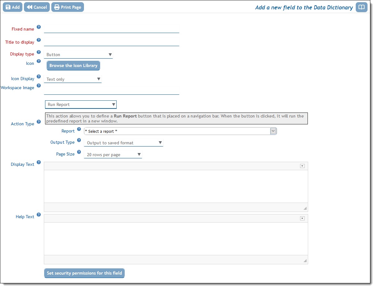
Within the Data Dictionary, the buttons are added within the LABELS / BUTTONS tab and within the Design Center right-click on an empty cell in the layout and choose to Create Label / Button… Complete the form by adding, at minimum, the Fixed Name, Title and the Display Type. Select the Action Type. You will see this screen after choosing Button as the Display Type and Run Report as the Action Type:

After completing the form with an Icon, the Display Text, the Help Text and the Action Type you should save the new button with the Add button at the top of the screen. You can style the button now, or at any time by editing the field within the Design Center or Data Dictionary.
Creating the Home Page Layout
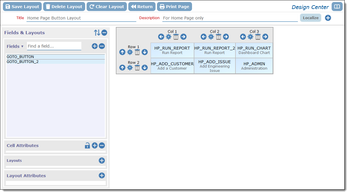
You may have done this earlier within the Design Center, but if not, now is the time to do this. Typically you will place a limited number of buttons on the Home Page so as not to make the layout too complex for end users, but there is no limit to the number of buttons you can place there. Only valid buttons that you have already created appear in the Fields & Layouts list. Drag these to the location you want them to appear.
Your layout may then look similar to this:

Styling the Buttons
The buttons you have created will initially take on the same default look as other buttons on ExtraView’s screens. However it is very likely that you will want to style the buttons you create to be visually attractive. You can achieve styling the buttons from within the Data Dictionary by editing the button field or by right-clicking on the button within the Design Center, and clicking the Edit Field option. This takes you to the editor screen for the field. Styling is achieved by adding a GLOBAL ATTRIBUTE to the field. Click this tab and then Create a new attribute.
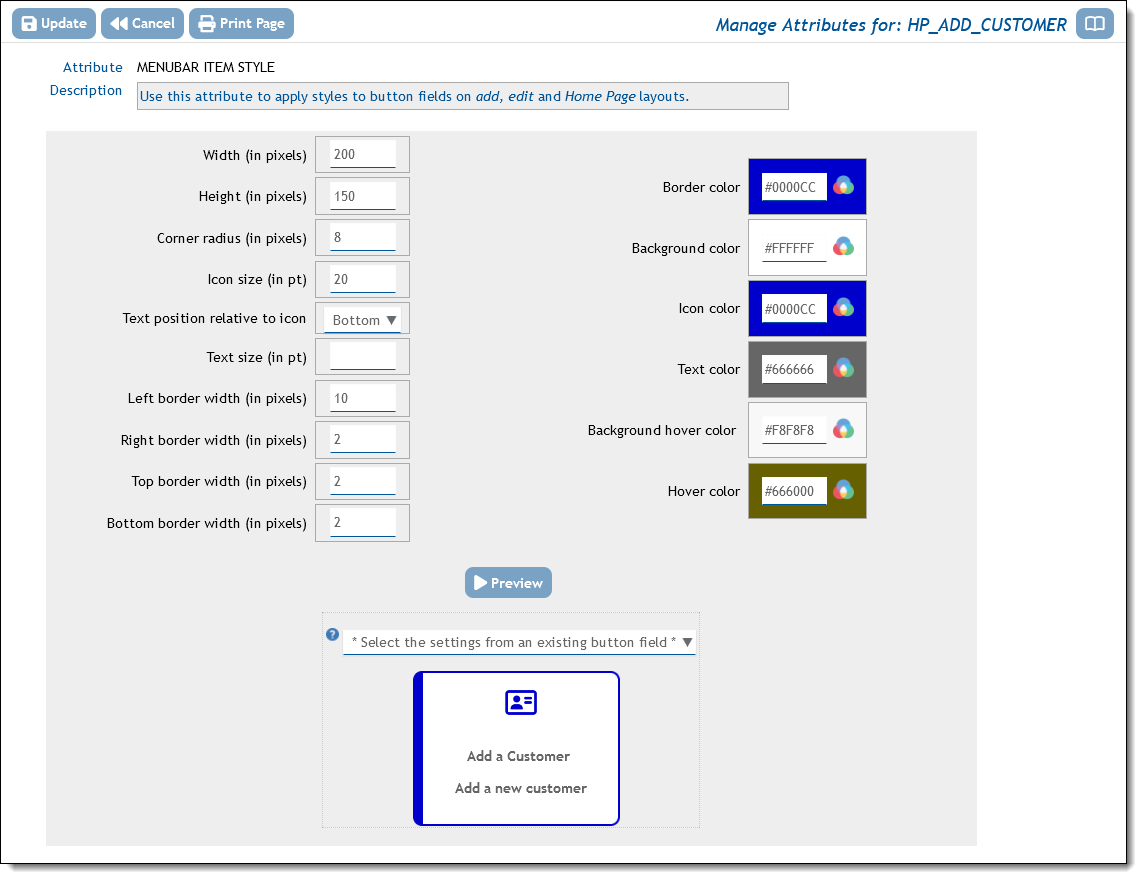
Choose the option for the attribute MENUBAR_ITEM_STYLE and you can complete the styling in the popup. For example, the style you set in the popup may look like the result you see when you click the Preview button as shown here:

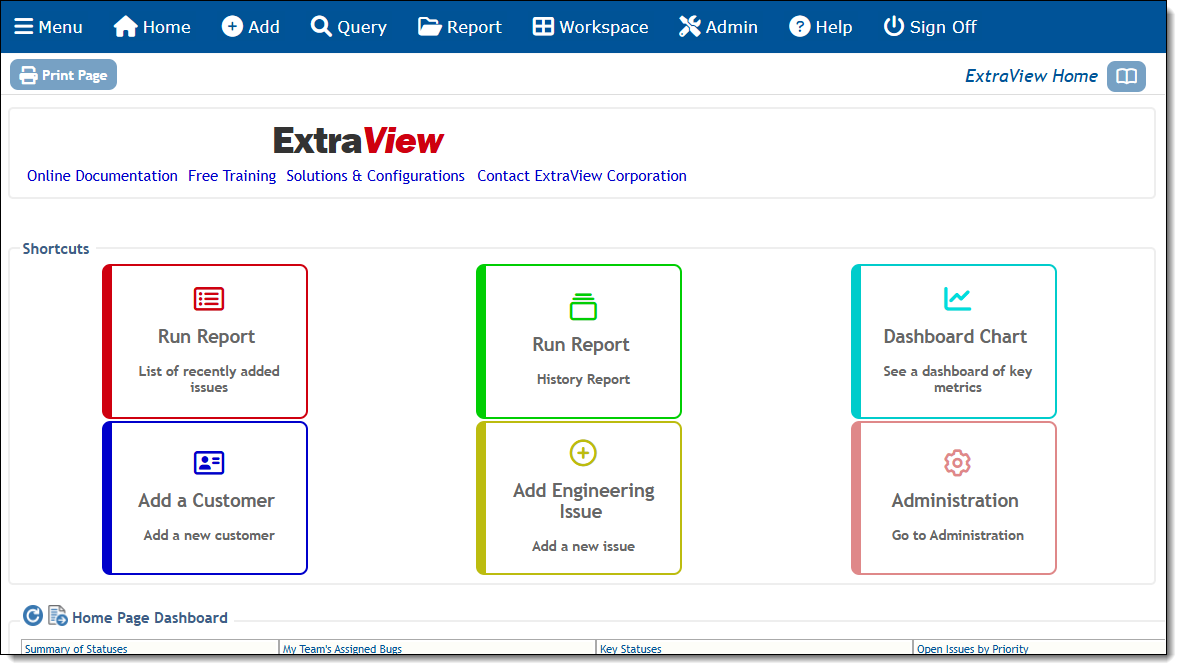
When creating several buttons for a Home Page layout, it’s likely that you will want to style them similarly, but use color as a differentiator. To avoid the tedium of creating the style for each button separately, you can click the * Select the settings from an existing button field * and select a button with the style you want to emulate. You can the either save this style or modify it to you liking, For example, you might want to alter border and icon color, but leave the size and other attributes. The above settings were used to produce this Home Page when the layout styles were applied:

