Menubar Layouts & Drop-Down Menus
Menubar layouts achieve two purposes. First, they provide the action buttons on the menubar of add and edit screens. Secondly they allow the creation of a drop-down menu stored within a single cell within an add or edit screen. Each installation has a default menubar layout for the add layout – the MENUBAR_LAYOUT_ADD layout, and for the edit layout – the MENUBAR_LAYOUT_EDIT layout. In the normal way, you can either inherit these layouts for different Business Areas and Projects, or you can create these layouts within any Business Area or Project. You create your own layout for drop-down menus by creating a layout type and then embedding this in the add or edit layouts.
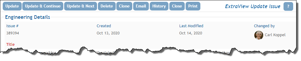
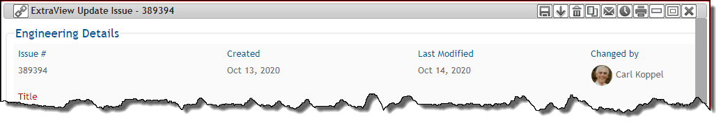
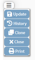
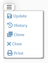
The above image shows the inbuilt layout for the standard interface. If you move into a workspace, this menubar is rendered like this:
The menubar buttons are placed on a layout, in exactly the same manner as for all other layouts. For the above menubar, the layout looks like the following image. Note that menubar layouts are automatically placed at the top of the add and edit screens and do not need to be embedded within the add and edit layouts:

Like all other layouts, button fields may be rearranged, deleted and added to the menubar layouts. Layout cell attributes may also be applied to the buttons. The inbuilt buttons available, and defined in the data dictionary are:
| Field Name | Title | Permission Key | Purpose |
| MENUBAR_ITEM_CLONE | Clone | PR_RESOLUTION.CLONE | Copy all the fields in this item to a new item |
| MENUBAR_ITEM_CLOSE | Close | Exit and discard any changes made | |
| MENUBAR_ITEM_DELETE | Delete | PR_RESOLUTION. DELETE_BUTTON |
Permanently delete this item from the database |
| MENUBAR_ITEM_EMAIL | PR_RESOLUTION. EMAIL_BUTTON |
Create and send an email using the contents of this item | |
| MENUBAR_ITEM_HISTORY | History | PR_RESOLUTION. HISTORY_BUTTON |
View the historic audit trail for this item |
| MENUBAR_ITEM_INSERT_CONT | Insert & Continue | PR_ADD_PROBLEM. SAVE_AND_CONT_BUTTON |
Add this item and continue editing |
| MENUBAR_ITEM_PRINT | Print the current page | ||
| MENUBAR_ITEM_SUBMIT | Submit | MENU.ADD_PROBLEM | Add to database |
| MENUBAR_ITEM_UPDATE | Update | PR_RESOLUTION. EDIT_BUTTON |
Update this item and exit from the screen |
| MENUBAR_ITEM_UPDATE_CONT | Update & Continue | PR_RESOLUTION. SAVE_AND_CONT_BUTTON |
Update this item and continue editing. Note that you can add an attribute of PAGE, AJAX or DEFAULT to this data dictionary entry to control page refreshes when this button is clicked |
| MENUBAR_ITEM_UPDATE_NEXT | Update & Next | PR_RESOLUTION. ALLOW_EDIT_NEXT_PREVIOUS |
Update this item and open next one for editing |
| MENUBAR_ITEM_UPDATE_PREV | Update & Prev | PR_RESOLUTION. ALLOW_EDIT_NEXT_PREVIOUS |
Update this item and open previous one for editing |
Each menubar button created may have an optional icon that is displayed within the button. These are selected within the data dictionary edit screen for the button. You may elect to display the text only, the text plus icon or the icon only.
Note that most of these buttons also have permission keys, allowing you to turn them on and off on any layout, on a role-based basis.
You may not alter the purpose and action of any of the inbuilt buttons, although you can apply any of the available layout cell attributes. However, you may create additional buttons within the data dictionary and place these on their menubar layouts and apply any one of a large number of actions. These are created as fields within the Buttons tab of the data dictionary, and are given a display type of Menubar Item.
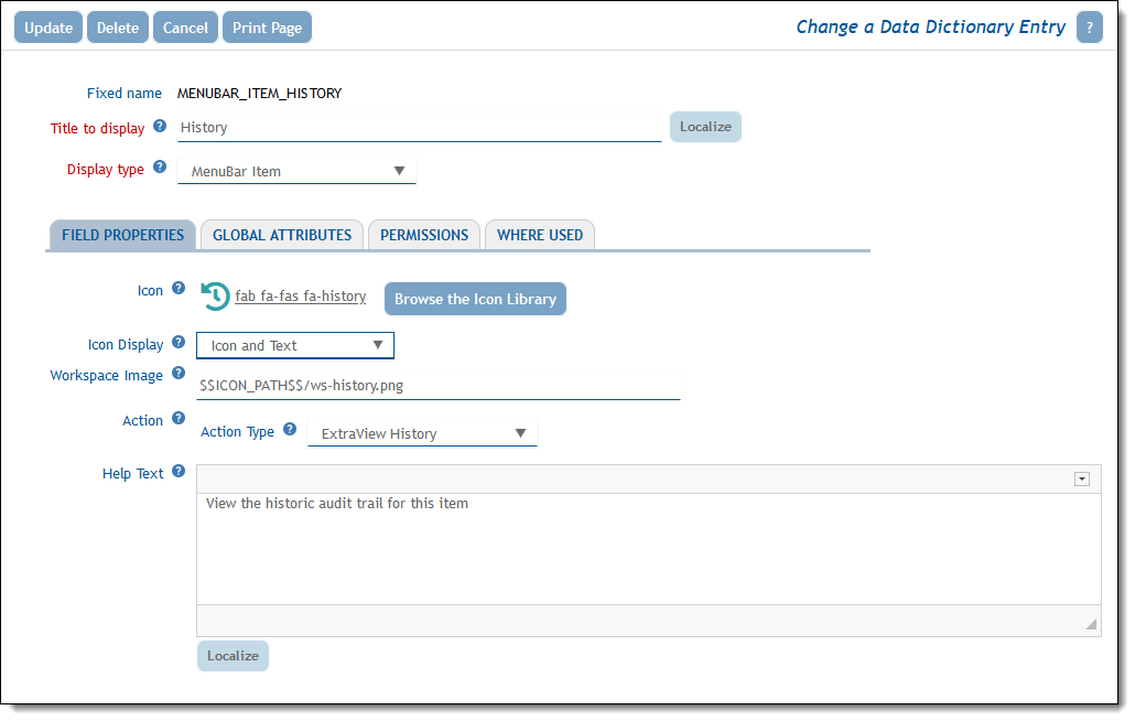
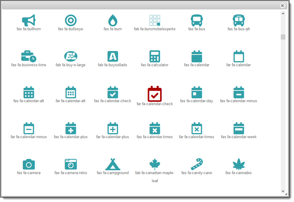
To choose the icon to display with a menu button, click the Browse the Icon Library button, and select from the library of approximately 1,500 available icons.
If you elect to display Icon and Text, the original screen becomes this:
Layout Cell Attributes
Many layout cell attributes may be applied to menubar buttons, to style and control their functionality. The most likely that you will use are:
| Attribute | Global Use | Purpose |
| ALT TITLE IF | You can use this attribute to alter the title on the button according to your workflow | |
| MENUBAR ITEM CLASS | Y | This attribute allows you to define your own CSS class to style the button. This is most useful if you want to style many buttons the same, and to define the style once. The CSS class name you use may be defined within the user_stylesheet.css file |
| STYLE | Y | This allows you to define the CSS styling for the button |
| STYLE IF | This attribute allows you to alter the styling of the button according to your workflow | |
| VISIBLE IF | This attribute allows you to alter the visibility of the button according to your workflow | |
| WS IMAGE | This attribute allows you to define a workspace image for the button |
Menubar Buttons within Add & Edit Screens
There is no requirement to place a menubar button on the menubar. You can place any of the buttons at any location within Add and Edit layouts. However, the buttons should then be removed from the menubar, to avoid the duplication of a menu function.
Menubar Buttons on Related Issue Display Pre-Headers
Menubar buttons can be placed on the pre-headers of Related Issue Displays.
Creating Drop-Down Menus
The examples in this section all use CSS styles applied on top of the Light grey color navigation bar with blue tones and icons user interface theme. The CSS will vary for other themes. It is suggested that the administrator be familiar with CSS or that they reach out to the ExtraView Customer Support team for assistance.
Drop-down menus appear as a single button on the screen. The buttons within the drop-down menu can be any of the buttons defined with the Menubar Item display type. A drop-down menu appears like this, once the button is clicked, and the user can select any of the items in the menu with a single click:
The principles of creating a drop-down menu are to first create a layout, using the administration utility Create and Maintain Layout Types. The layout type that you use to create drop-down menus is named Layout Buttons. This layout is embedded within an add or edit layout, or an embedded layout within either of these. In the normal manner, you place the menu item fields within the embedded layout you created with the layout type of Layout Buttons. This layout used in the following example is:
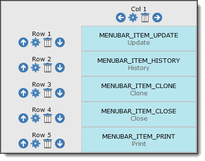
This layout creates the following drop-down menu. At this point the rendered layout adopts the same style as buttons on the menubar. This style varies according to the user interface theme, but may look like this:
After applying a layout element attribute of STYLE with a value of color:#79a2c4 !important; background-color: #fff !important; width:125px; text-align:left to each button, the drop-down menu may look like this:
Note the use of the CSS !important attribute to override the built-in color and background color.
Given that you have a number of buttons to style identically, and that you may want to go further with mouse hover effects, it can be useful to create a CSS class and enter this into the user_stylesheet file as an alternative to using the STYLE layout cell attribute. To see the underlying CSS that you want to modify / override, look in the stylesheets folder of your installation and then within the folder that corresponds to your existing theme. The CSS class you are modifying / overriding is named menuButton and the corresponding menuButton:hover entry. For example, for each menu item, add a class of MyMenuButtons. Within the user_stylesheet file enter this CSS:
.MyMenuButtons { color: #79a2c4 !important; background-color: #fff !important; width: 125px; text-align: left;}.MyMenuButtons:hover { text-decoration: underline; color: #cc0000 !important; box-shadow: none !important;}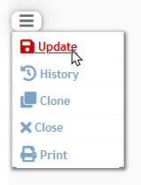
Creating Your Own Menubar Buttons
As stated above, you use the Buttons tab within the data dictionary to create your own menubar buttons. They are given a fixed name, a title and then the display type of Menubar Item. If you would like an icon to accompany the display of the button, click the Browse the Icon Library button to select from the library of about 1,500 icon images. As described below, you may want to create a different icon for workspaces.
The action for any menubar icon that you create allows you to invoke any of the standard built-in button functions, or to define your own action. The actions you define leads to additional prompts to gather the information needed to complete the action when the button is clicked.
| Action | Purpose |
| Open URL | This action requires the entry of a URL plus any parameters required to complete the action. The URL will target a new browser tab for its output |
| Run Report | You can select the report to run from any shared report previously saved. You can select the output type and the page size for browser output. Again, the action will target a new browser tab |
| Custom Action | Custom actions allow you to execute or to call a JavaScript function. This allows for any further processing to take place, either within the JavaScript or by calling the server with the userSubmitChangeAjax function |
| ExtraView Clone | The ExtraView Clone function is emulated with this action |
| ExtraView Close | The ExtraView Close function is emulated with this action |
| ExtraView Delete | The ExtraView Delete function is emulated with this action |
| ExtraView Email | The ExtraView ad-hoc Email function is emulated with this action |
| ExtraView History | The ExtraView History function is emulated with this action |
| ExtraView Insert & Continue | The ExtraView Insert & Continue function is emulated with this action |
| ExtraView Print Page | The ExtraView Print function is emulated with this action |
| ExtraView Refresh | The ExtraView Refresh Button is emulated with this action |
| ExtraView Related Issue Display | This action is configured differently than other actions in that a button is created that is placed on each row within a Related Issue Display, as opposed to placing buttons on the header of the Related Issue Display. Buttons created with this action call a JavaScript function that can refer to the specific row (issue) within the Related Issue Display and link this row to and action within the parent issue.Example 1 – Displaying the Results of a Search within an Add or Edit Screen We might want the end user to have a button on each row that displays the results of a search within an add or edit screen. When the button on a result row is clicked, the issue on that row is automatically linked to the parent record. This can be a more intuitive interface than defining a single button on the header of the Related Issue Display and having the user check all issues to be linked before clicking another button on the header to relate all the selected issues. This is accomplished by defining a menubar button with a custom action of:
Example 2 – Execute an Action to Update an Issue on the Current Row of the RID Another example is to place a button on the Related Issue Display which executes an action to update the issue on the row of the Related Issue Display. For example, you might want an action button that, when pressed, alters the STATUS of the issue to Closed. Let’s say the menubar button is named
The button field is placed on the Related Issue Display layout. The pressing of this button on the row of the RID causes a business rule to trigger, thereby updating the issue. When the user clicks the button, the action replaces
Given this update is on a single row of the Related Issue Display, you might want to communicate this action to the parent record via a subsequent rule:
Example 3 – Copying Selected Attachments to Selected Child Issues This example shows how a button placed on the pre-header of a Related Issue Display can copy selected attachments from the current parent issue to child issues which are selected on each row of the Related Issue Display. A Data Dictionary entry created as a User Defined Field with a display type of Text Field. Let’s say this is named Now, create a menubar button within the Labels / Buttons section of the Data Dictionary. For our example this is named
This button field is placed on the Related Issue Display layout. To trigger the copying of selected attachments on the parent issue, when the button on the Related Issue Display is clicked, create a business rule similar to the following: <== onchange ==> |
| ExtraView Submit | The ExtraView Submit function is emulated with this action |
| ExtraView Update & Prev | The ExtraView Update & Prev function is emulated with this action |
| ExtraView Update | The ExtraView Update function is emulated with this action |
| ExtraView Update & Continue | The ExtraView Update & Continue function is emulated with this action |
| ExtraView Update & Next | The ExtraView Update & Next function is emulated with this action |
Menu Buttons and Business Rules
The most common purpose in defining your own menu button is to be able to execute some Business Rules when the user clicks the button. As an example, you may want to set the value of several fields when the user clicks a button they have defined. This is easily achieved as follows:
- Create the button in the data dictionary, or from within a layout in the Design Center. For this example, the button is named MY_BUTTON. You do not need to select an Action Type
- Add the field to a layout
- Create a Business Rule within the Area where the layout resides. This will look like:
<== onchange ==>

if (MY_BUTTON.{changed}) {

PRODUCT_NAME = 'Tracker';

MODULE = 'API';

} -
When the user clicks the button, the two fields will have their values set to those in the rule.
- Create the button in the data dictionary. For this example, the button is named MY_BUTTON. You do not need to select an Action Type
- Add the field to a layout
- Create a Business Rule within the Area where the layout resides. This will look like:
<== preupdate ==>if (MENUBAR_ITEM_UPDATE.{changed} and PRODUCT_NAME != 'Tracker') {{STOP: Ouch! You have selected the wrong product}} -
If the product name is not Tracker when the user updates the issue, they will see the error message and the update is cancelled.
onchange and preupdate directives.Menu Buttons that Run Reports
Menu buttons that use Run Report as an Action Type have some special properties. First and foremost, you can use a filter with * Ask at Runtime * to pass into the report filters from field values on the current add / edit screen. For example, if you set a filter of PRIORITY = * Ask at Runtime * within the report then, when the value of the PRIORITY field on the current screen is P 3 and the user clicks the button, the report to be run will use the value of P 3. At the same time, the properties of the button can be used to set the output type of the report. Note that not all output types are valid for all report types.
Menu Buttons with Custom Actions
Custom actions are used to trigger code. This can be custom code in Java or JavaScript. The entry is always to a JavaScript function and this JavaScript function may execute an Ajax call to the server.
- JavaScript can be contained within the data dictionary by entering the code into the Custom Action field after selecting the Action Type of Custom Action. For example, to simply set an alert when the button is clicked, you might enter something like this:
javascript:alert('You clicked the custom button'); - To execute a custom JavaScript function within the UserJavaScript.js file, you might enter something like this:
javascript:MyFunction(MyParameters)
Workspace Considerations
The inbuilt workspace already utilizes icons (without text). These icons are defined in the data dictionary edit screen for each button, at the Workspace Image entry on the screen. A path pointing to $$ICON_PATH$$ allows ExtraView to select the appropriate built-in icons from the appropriate user interface theme. Icons are not provided for new menubar buttons that you create, but these are easily created. The specifications for large workspace icons is that they should be 23 pixels wide and 20 pixels high. For small workspace icons they should be 18 pixels by 16 pixels. They should have a transparent background and have 2 pixel rounded border with a color of #666666. As a shortcut, you can select one of the icons provided in the base theme you are using, edit this and then save it to a location. The location of your icons should be outside the ExtraView installation, but accessible to the application. You may enter the path to the image in the field Workspace Image. Of course, you can also point to an existing image within the base installation with your own menubar button that you can create if you do not want to create an image of your own.