Layout Cell Attributes
Layout cell attributes allow you to modify the appearance or function of a field or an embedded layout within a layout. This includes creating dependencies between fields and controlling related issue displays.
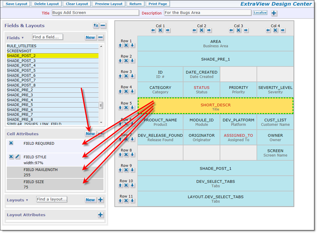
Layout cell attributes
Note the section on the screenshot that displays the Cell Attributes. This displays the attributes that have been set for the cell, as well as attributes that were set for the field in the data dictionary as global field attributes. The global attributes are displayed with the darker background. You may either use the global attribute inherited from the field definition, or override the global attribute with a local layout cell atrtibute. If you add a new attribute, a screen similar to the following is displayed:
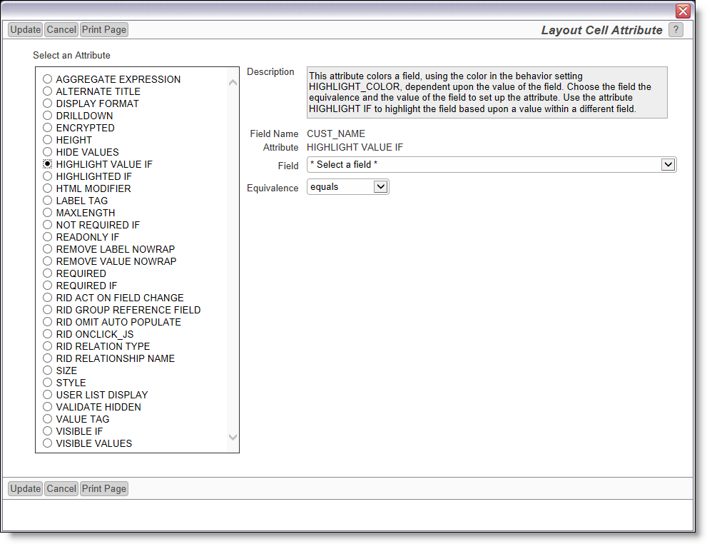
Adding a layout cell attribute
As you click on a button beside an attribute, a help tip appears to give guidance on how to use the attribute; also, you see the selections you need to make to configure the attribute. Not all attributes require selections. For example, the VALIDATE HIDDEN attribute does not need any additional configuration.
Note that the field within the list named LAYOUT_TYPE is a special field and does not exist as a field on the layout itself. If selected, it takes either the value ADD_PROBLEM or EDIT_PROBLEM. These refer to the add screen and the edit screens. You may then create a layout cell attribute such as FIELD REQUIRED IF LAYOUT_TYPE = ADD_PROBLEM or FIELD VISIBLE IF LAYOUT_TYPE = EDIT_PROBLEM.
Note that you will only see a subset of the complete number of layout cell attributes for a given field or layout selection, these being the ones that are valid for the field display type or layout type that you have selected in the main grid. If a layout cell attribute does not appear when you are editing the attributes, it is because that attribute is not valid for that field or embedded layout. The attribute types are the different class of modifiers that can be applied to each cell. These are:
| Attribute | Purpose | ||||||||||||||||||
| ACT ON FIELD CHANGE | This attribute triggers relationship group actions when the field value upon which this attribute is based, changes. This is used when you set up a search layout to bring back results, on an ADD_PROBLEM or EDIT_PROBLEM layout. This configuration relies on an intermediate field, the RID LINK FIELD NAME. You place this attribute on that field, so that when it receives your selection, it uses the information to update the embedded layout that contains the related issues from the results. See the example here for use of this attribute. | ||||||||||||||||||
| ADD NEW |
Adds a * New * value entry to list and popup field types, on ADD_PROBLEM and EDIT_PROBLEM layout types only. It modifies all user defined list fields, the PRODUCT_NAME field, the MODULE_ID field, the RELEASE_FOUND or the RELEASE_FIXED fields so that a value of * New * apprears within the list. When this * New * value is selected a modal popup window allows the addition of a new entry into the list. This has the same effect as an administrator using the list manager function to add a new entry to the list, but puts the ability in the hands of an end user without their requiring administrative privileges. This feature can be controlled by user roles. If the behavior setting named AUTO_POPULATE_ALLOWED_VALUES is set to YES, the an allowed value relationship is created automatically when the user adds a new value, and the parent value has already been selected on the add or edit screen. There is a single option available when creating this layout cell attribute. There is a checkbox with the title Do not export values added by users when exporting data with the Metadata Export utility, When checked, the new field values entered by users into the field will be flagged to not be exported with the Metadata Export utility. Thus, the new values will not be migrated to other ExtraView instances. |
||||||||||||||||||
| ADMIN NOTES | This attribute has no functionality, except to allow the administrator to document the field attribute for future reference. Any text may be entered into the value of the attribute and it will be displayed within the Design Center and when editing the attribute. | ||||||||||||||||||
| AGGREGATE EXPRESSION | This layout cell attribute implements a method to compute an aggregate expression on a per-row basis on a Related Issue Display. The actual calculation is performed in a user custom exit, so this attribute must be accompanied with Java code. This layout cell attribute only works when used with expression display type fields placed on a Related Issue Display and has no effect in other locations. See the page Field Aggregate Expressions for more information. | ||||||||||||||||||
| AGGREGATE EXPRESSION TITLE | This layout cell attribute provides a title to the aggregate expression. Please see the page Field Aggregate Expressions for more information. | ||||||||||||||||||
| ALTERNATE TITLE |
This will rename the screen title in the Data Dictionary to the value in the Field value, for the field in the Field entry. Note that if this is used in a screen layout, you can include HTML in the alternate title. If HTML is included within the alternate title, then the behavior setting of LABEL_WRAP_POSITION is ignored. This allows total control of the formatting of the label within the layout. However, if you access the field through the API or CLI then the HTML will be passed through to the output. As the text for the alternate field title is placed within double quote marks (“) in the HTML generated when the form is rendered, you should not use these within the alternate field title. You may use single quote marks (‘) however, and these are generally interchangeable. It is a best practice to create a title for all field without any HTML within the data dictionary, and to only use HTML within individual layouts. This makes the fields easier to view under most circumstances, especially report editors and report output. You should restrict the use of HTML <br> tags within Related Issue Display layouts as they may appear cut off at the bottom of the title. The titles within a Related Issue Display are sized exactly to a single row, so that they may be frozen in position when a long list of related issues is scrolled. Example: Within an organization, you may label issues as Defects, but you may want to label them as Issues for your customers. On the new attribute form, you would set Alternate field name equals Issue Example: A field on the form has the particularly long title of “Target Software Release” that wraps in an ugly way on the screen using the system-wide default you have set with the behavior setting, LABEL_WRAP_POSITION. You can control where the line breaks occur by using something similar to “Target<BR>Software<BR>Release” Example: You want to remove the title to a field on a layout. It is not valid to use a blank title. The solution is to use an alternate field title of . This inserts the character set value of a space into the layout. |
||||||||||||||||||
| ALTERNATE TITLE IF | This is similar to ALTERNATE TITLE, but allows the alternate title to be conditionally placed on a field | ||||||||||||||||||
| ATTACH REPORT | This attribute is only available with notification layouts and may have one of three values. When set, the embedded report can be embedded within the email body, attached to the email, or both. The default if this attribute is not set is that the report will be embedded within the body of the email at the point in the layout where the embedded report is placed. See here for more information on embedded reports | ||||||||||||||||||
| ATTACHMENT LINK | This layout cell attribute is applied to TEXTAREA, HTMLAREA and LOGAREA fields on add and edit and embedded layouts. It results in the rendering of a button on the layouts with which the user may upload attachments. These attachments are created in the attachment area of the layout in the normal way, and also retain an association with the field to which the attribute is applied. The name of the attachments added appear alongside the field, with a link which can be used to add the attachment. The use case in which this is generally applied is on LOGAREA fields when many attachments might be added over the lifespan of updating an issue. The link provides a convenient way to view the attachment(s) added with a specific entry to the LOGAREA field. When the field is rendered on reports, the attachment links are also rendered. | ||||||||||||||||||
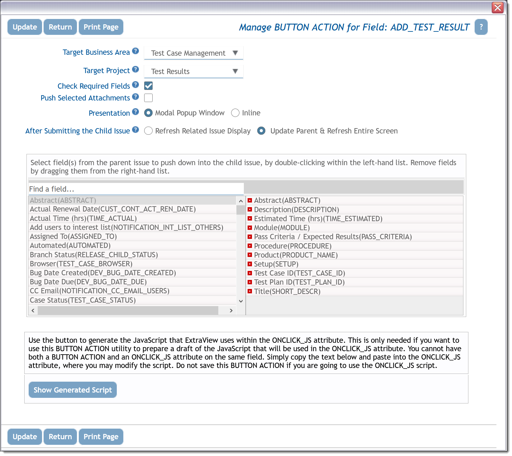
| BUTTON ACTION |
This attribute is applied as a cell attribute to the ADD BUTTON within a related issue display header. The ADD BUTTON is configurable to allow a child issue to be added to the current parent issue that is being displayed on an add or edit layout. The action defines what happens when the user presses the add button.
|
||||||||||||||||||
| COLLAPSE REPEATING ROWS | This attribute should only be used on an embedded repeating row layout with a type of report. Typically this is used when you are rendering fields from different repeating row layouts within the emedded layout, and you want the values to align as far as possible, to the top of the embedded layout. As the values from the different fields are likely to have originated in different records in the database, they would normally be rendered on different rows. This attribute shifts the values to be aligned from the top of the display for the embedded repeating row | ||||||||||||||||||
| DATE TIME CATEGORY | This attribute is used to define date time categories as either COMPONENT or DURATION | ||||||||||||||||||
| DISPLAY FORMAT |
This will modify the display of the value of the item according to a user-defined format. The format can include text as well as the values of other fields. There are specific rules for using this attribute successfully:
Example: You can set up a new field on a layout, modifying the ID field for display to be of a specific format such as PROJECT + ‘.’ + ID. The ID will be the standard sequence, but will show a value such as MyProj.12345. |
||||||||||||||||||
| DO NOT CLONE |
This setting is primarily used in conjunction with mapping fields within one ExtraView installation to another ExtraView installation, via the peer integration daemon. If an issue that is mapped is subsequently cloned, the mapping identity field should not be propagated to the cloned issue. The reason for this is that it would establish a mapping from one peer issue to two issues (i.e. the original issue and its clone). This is not a fatal error, but the behavior produces an ambiguous result, causing updates to the peer issue for each update to either the original issue or the cloned issue.
To handle this behavior, the data dictionary attribute named DO NOT CLONE prevents the cloning of the field value for specific fields. This attribute is set when the field is used as a mapping field in the integration daemon. Setting the DO NOT CLONE data dictionary attribute for a field means that the containing field’s value will not be propagated to any clone of an issue – its value will be null in the cloned issue. |
||||||||||||||||||
| DRILLDOWN | You should only add this attribute to a field when it is to contain an issue ID. Adding the attribute will turn on the ability to click on the field value in order to be able to drill down into that issue and open up an edit screen | ||||||||||||||||||
| DRILLDOWN TARGET |
This attribute is used in conjunction with the DRILLDOWN TARGET REPORT attribute. Together they define how to handle drilldowns from the embedded report presented on the add or edit screen. The drilldown target defines the name of the layout embedded on the screen which will contain the report that displays the drilldown results. If this is not defined, a new browser tab is targetted for the drilldown results within the standard interface. Within a workspace interface, a new workspace panel is generated to display the drilldown results.
The drilldown target layout must be a layout that was created with a usage of Embedded Report – Creates a layout that contains a report to be embedded within an Add or Edit screen. There are four such layouts predefined, but you may create as many of these as you need. The four predefined layouts are: EMBEDDED_REPORT – Embedded Report Note that you should edit any of these embedded layout types and make sure that you save an empty layout of that type. See here for more information on embedded reports |
||||||||||||||||||
| DRILLDOWN TARGET REPORT | This attribute is used in conjunction with the DRILLDOWN TARGET attribute. Once you have the target specified, you use this attribute to nominate the specific report you want to generate. This must be a shared public report. You can use the * Ask at Runtime * filter within the report definition to pick up values from the embedded report and use these while generating the drilldown report. For example, the user might click on a cell in the embedded report which identifies a value for a specific STATUS and PRIORITY. If these two fields are used as runtime filters in the drilldown target report, then the values from the embedded report are used as filters for the drilldown report | ||||||||||||||||||
| EDIT RID PARENT ID | This attribute only applies to EDIT RID LAYOUTS. This layout cell attribute nominates the name of the field to be used to contain the parent ID to which the EDIT RID is connected | ||||||||||||||||||
| EDIT RID SHOW COLUMN HEADERS | This atribute only works with EDIT RID type layouts and renders any field names at column headers at the top of the display, rather than next to or above the individual fields. When you use this attribute, if there are other cell attributes on the field that affect the label (LABEL STYLE, LABEL STYLE IF, ALTERNATE TITLE, LABEL TAG) they will be evaluated first and then the resulting label will be rendered at the top of the display. | ||||||||||||||||||
| EDITOR TOOLBAR | This behavior setting allows the overriding of the behavior setting named EDITOR_TOOLBAR. This is used to provide an alternative toolbar to any HTML Area field as opposed to the one nominated in the behavior setting. It may have a value of BASIC, STANDARD, FULL or CUSTOM | ||||||||||||||||||
| EMBEDDED REPORT NAME | This allows for the selection of a report to embed within an add or edit screen. This attribute is only available on layout types of Embedded Report and only selects shared reports and reports saved for user roles. See here for more information on embedded reports | ||||||||||||||||||
| ENCRYPT | Encrypt the values within the field | ||||||||||||||||||
| EXPRESSION TEXT | This is used to add a calculated expression to a user defined report field. | ||||||||||||||||||
| GEO ADMIN BOUNDARY LEVEL | A geospatial attribute. Administrative boundaries range from large groups of nation states down to small administrative districts and suburbs specfied by this value, which takes a value of 2(a single Country), 3(a State or Province) or 4(a County). | ||||||||||||||||||
| GEO GROUP | A geospatial attribute to group LATITUDE, LONGITUDE and MAP_RELIABILITY_LEVEL into a set of geospatial data dictionary fields and used in geospatial reports. | ||||||||||||||||||
| GEO LATITUDE | A geospatial attribute to indicate the latitude field. | ||||||||||||||||||
| GEO LONGITUDE | A geospatial attribute to indicate the longitude field. | ||||||||||||||||||
| GEO RELIABILITY LEVEL | A geospatial attribute to indicate the reliability field. | ||||||||||||||||||
| GRIDEDIT BUTTON | This attribute provides a button with the title Gridedit, on the preheader of the Related Issue Display. When clicked, this button renders all the issues on a Related Issue Display in Quickedit mode within an edit screen. The user is required to click the Update button on any issue before it is saved in the database. If you wish to alter the title on the button, it is controlled with the data dictionary field named GRIDEDIT_BUTTON. | ||||||||||||||||||
| HEIGHT |
This applies to text area, log area, print text fields and embedded relaetd issue display layouts. The height is the approximate number of characters high that the field is displayed with when the user first brings up an add or edit layout.
Example: To create a text area field where the initial display height is 20 characters, add a HEIGHT attribute with a value of 20. Note that RELATED_ISSUE_DISPLAY layouts are automatically sized in height, according to the number of issues they contain, and the FIELD HEIGHT is the maximum height that a related issue display will occupy, before a vertical scroll bar is added. |
||||||||||||||||||
| HELP TEXT | This applies to add and edit screens and their embedded layouts. When added to a fields, the attribute overrides the help text from the data dictionary, and presents the help text defined within the layout. This allows you to define different help for different screens within your application. | ||||||||||||||||||
| HIDE VALUES |
This attribute allows you to hide individual values within a field which contains a list of values. When you select this attribute, you are presented with a list of all the values within the field, and you select the values you want to hide unconditionally. This may be used with great effect on fields such as AREA on an add layout, to constrain a user to only be able to add new issues into specific business areas, and to lock the user out from other business areas. Note that if you configure this attribute, you may not then configure a FIELD VISIBLE VALUES attribute on the same field.
This attribute is only supported on fields with a display type of List (including multi-value list, put not popup lists), Radio Button and Tab. |
||||||||||||||||||
| HIDDEN VALUES IF | This attribute is similar to HIDE VALUES, except that you can conditionally hide the values in a list, according to a logical expression based on other fields within the form, | ||||||||||||||||||
| HIGHLIGHT VALUE IF |
This provides the ability to alter the color styling of a field value, based upon a logical expression defined within the layout cell attribute. This attribute only works with display types of text and text area.
Example: To highlight the value of the ID of an issue, if the issue is a customer issue, you might apply a layout cell attribute to the ID field – HIGHLIGHT VALUE IF CUSTOMER IS NOT NULL. |
||||||||||||||||||
| HIGHLIGHTED IF |
This provides the ability to alter the color of a field title, depending on the condition specified. The color may be selected by setting the value for the behavior setting HIGHLIGHT_COLOR. You may have more than one FIELD HIGHLIGHTED IF attribute on a field.
Example: We want to highlight the title of the ID of an issue, if the issue is a Customer issue. To achieve this, set the element attribute of HIGHLIGHTED IF on the ID field, if the field named Customer is not null. |
||||||||||||||||||
| HOVER VIEW DEFINITION |
This attribute is used to define hover text that appears over buttons, when the user holds the mouse steady over the button. The administrator can configure which fields are displayed in the hover popup with this layout cell attribute. When you select the attribute, you will see two field lists. The left-hand field list presents all the available fields. Double click on the fields you wish to add to the hover text and they appear in the right-hand panel. Alternatively, drag the field to the right-hand panel from the left-hand panel. Drag the field out of the right-hand panel into the left-hand panel to remove it from the hover text popup.
Typically this is used to bring up the full description, plus any other fields, of an issue for viewing, as a shortcut to the user having to drill down into the issue to see the key information. The definition of the popup is valid on various, but not all buttons. It works on VIEW_BUTTON, EDIT_BUTTON, DELETE_BUTTON, HISTORY_BUTTON and QUICKEDiT_BUTTON, on add, edit, report and related issue display layouts. |
||||||||||||||||||
| HTML MODIFIER |
This allows the user to provide values for additional attributes within an HTML tag on an add or edit layout. You may have any number of HTML modifier attributes on a cell. It is likely that you will need a reasonable understanding of HTML tags and attributes to use this layout cell attribute.
Example: A DISABLED HTML modifier to the attribute will disable the field. Most browsers would then show this field as “grayed-out”. ExtraView has a special HTML modifier value that provides an enhanced rendering for fields that you want to disable. If you enter the value as evClass=readonly then the disabled function is extended to work with all fields, not just input and list fields. In addition a disabled icon will appear when the user places their mouse cursor over a field with this attribute. The evClass=readonly value must be entered exactly as shown, with no spaces or other characters within the entry. Example: Use the HTML modifier to call a user-defined JavaScript function or to call a pre-defined JavaScript function within ExtraView. The function resides on the server and is automatically included in the HTML that is generated for the layout. The syntax specified within the HTML modifier to call a user-defined JavaScript function will be similar to: onclick=’myFunction(param1, param2)’; For a more detailed explanation of custom building JavaScript functions, please see the ExtraView User Custom Programming Guide. If you want to add a style attribute to a layout element, you should use the style (rather than the html modifier attribute) otherwise your cell element may have multiple style attributes, which is invalid HTML syntax. A reference providing a list of all valid CSS styles may be found at http://www.w3schools.com/css/css_reference.asp. Note that this layout cell attribute only works when used within a layout that is rendered as an add or edit screen. |
||||||||||||||||||
| HTML MODIFIER IF | This attribute works in the same fashion as HTML MODIFIER, but allows for a logical condition to be added to its definition as opposed to always taking effect | ||||||||||||||||||
| IS RANK | This defines the field to be a rank field on the layout. Only apply this attribute to numeric fields | ||||||||||||||||||
| LABEL STYLE | This attribute allows you to add a CSS style to the label of field on a layout | ||||||||||||||||||
| LABEL STYLE IF | This attribute works in a similar fashion to LABEL STYLE, but with the added support for logical conditions so that the style can be applied with an expression you define | ||||||||||||||||||
| LABEL TAG | This allows the administrator to add a new attribute to the HTML <TD … tag that surrounds the label of the cell. This can be used to provide a different style for the label, or to inject any other valid HTML into the cell label tag. It is likely that you will need a reasonable understanding of HTML tags and attributes to use this layout cell attribute. | ||||||||||||||||||
| LAYOUT SEARCH EXPANDED MODE | The attribute may only be added to layouts that have a type of search and are used to provide a search and selection mechanism on add and edit screens. When this attribute is selected for a search layout, all the fields on the layout are rendered in expanded mode, allowing the end user to make multiple selections within the fields being used as search filters | ||||||||||||||||||
| LAYOUT SELECTED |
This is for indicating which embedded layout to use on a screen depending on a tab or list value. This is one of two mechanisms that allow ExtraView to render alternative layouts, dependent on the value of a tab or list field.
Example: You want to embed a different layout, with a different set of fields on an edit screen, dependent on whether the user selects a Category of Software or Hardware. Note: If you are creating layouts which are selected according to a list or tab value, it is highly advisable to set a default value for the list or tab field. If you do not do so, and the field does not have a value, no embedded layout will be selected. The precise steps necessary to implement embedded layouts are documented in a following section, entitled Adding Embedded Layouts. |
||||||||||||||||||
| LIST BGCOLOR | This attribute sets the background color of the non-selected list values when the display format of the field is set to Box or Checkbox within the data dictionary definition of the field. Enter a hexadecimal color or an HTML color name. | ||||||||||||||||||
| LIST BORDER COLOR | This attribute sets the color of the border surrounding list values when the display format of the field is set to Box within the data dictionary definition of the field. Enter a hexadecimal color or an HTML color name. | ||||||||||||||||||
| LIST IMAGE DISPLAY | This attribute allows the display of enumerated list fields which have images associated with them to alternatively display just the image, just the title, or both the image and the title. Valid entries for this attribute are TEXT_ONLY, IMAGE_ONLY and IMAGE_PLUS_TEXT (this is the default) | ||||||||||||||||||
| LIST SELECTED BGCOLOR | This attribute sets the background color of the selected list value(s) when the display format of the field is set to Box or Checkbox within the data dictionary definition of the field. Enter a hexadecimal color or an HTML color name. | ||||||||||||||||||
| LIST TEXT COLOR | This attribute sets the color of the text of the list values when the display format of the field is set to Box or Checkbox within the data dictionary definition of the field. Enter a hexadecimal color or an HTML color name. | ||||||||||||||||||
| LIST TEXT SIZE | This attribute sets the font size of the text of the list values when the display format of the field is set to Box or Checkbox within the data dictionary definition of the field. You should include the measurement type, such as pt, px or em following the size you enter. | ||||||||||||||||||
| LIST WIDTH | This attribute sets the width of the of the field on the screen when the display format of the field is set to Box or Checkbox within the data dictionary definition of the field. You should enter a width as the number of pixels, followed by px. Note that there is a 10px padding around the text of all the labels within the cell containing the value, so the overall width of the cell is 20px greater than the number you enter | ||||||||||||||||||
| MAX FRACTION DIGITS | This attribute only applies within numeric type input fields on ADD_PROBLEM and EDIT_PROBLEM layout types. This provides an integer number that represents the number of digits to display, following a decimal point | ||||||||||||||||||
| MAXLENGTH |
This will add a MAXLENGTH=nnn attribute to the HTML display tag for the field, controlling the maximum number of characters that can be typed into the field. The default if no attribute is set is 255 characters. Used in this way, the attribute works when used within a layout that is rendered as an add or edit form. 255 characters is the maximum length of any user defined text field that you create
Example: Setting an attribute of MAXLENGTH equal to 25 on a field will restrict the amount of characters that can be entered into a field to 25 characters. |
||||||||||||||||||
| MENUBAR ITEM ACTION | This attribute controls the action triggered when clicking the menu button to which the attribute is applied | ||||||||||||||||||
| MENUBAR ITEM CLASS | This attribute controls the CSS class used when rendering the menu button. If you are defining your own CSS class, the entry for the style can be put in the user_stylesheets/user_stylesheet.css file. | ||||||||||||||||||
| MENUBAR ITEM CLASS IF | This attribute is applied to the selected field on this layout only. The value you provide is the CSS class used when rendering this menu button. | ||||||||||||||||||
| MENUBAR ITEM ICON | This property is used to select the icon that is rendered when viewing this menu button on Add and Edit screens. You must select an Icon Display that uses icons. Use the Browse the Icon Library button on the screen to view and select an apppropriate icon from the library. | ||||||||||||||||||
| MENUBAR ITEM ICON DISPLAY | This is used to control the rendering of this menu button on Add and Edit screens – Choose from Text only, Text and Icon or Icon only. | ||||||||||||||||||
| MODAL WINDOW | This layout cell attribute only has an effect if used on an EDIT_BUTTON within a Related Issue Display. When this attribute is set, and the user presses the Edit button on the Related Issue Display, a popup, modal window is used to provide the edit capability for the related issue. If this is not set, then the related issue is placed in a separate, new window. This provides control on whether you want to allow users to update a parent issue while editing a child or related issue. | ||||||||||||||||||
| MOST RECENT | This attribute only affects user defined fields with a display type of LOG AREA. When this is applied to a field on a layout, only the most recent entry within the field is displayed to the user, and all previous entries are suppressed. | ||||||||||||||||||
| NOT REQUIRED IF | This is the opposite condition to FIELD_REQUIRED_IF and is typically used when there are a significant number of values in a field, but the field only becomes not required on a few values. In this circumstance, it is faster to set up FIELD_NOT_REQUIRED_IF on a small number of values and set the overall required state of the field to Yes. Note that if you use the greater than or less than operators, they only work with numeric comparisons. | ||||||||||||||||||
| PHONE NUMER | Use this layout cell attribute on text fields to activate the international phone number masking on the field | ||||||||||||||||||
| READONLY IF |
This attribute indicates that the field value is to be displayed on the layout in a read only mode, based upon the value of another field. You may have more than one FIELD READONLY IF attribute on a field. For obvious reasons, this attribute only works when used within a layout that is rendered as an add or edit screen. Note that if you use the greater than or less than operators, they only work with numeric comparisons.
Example: We want to display the Customer name within the field named Customer on an edit layout, if the Customer has already been added, but make the field read / write if there is no value so the user can enter the Customer name. To achieve this, add an attribute of FIELD READONLY IF Customer is not null. If you place a FIELD READONLY IF attribute on a layout cell that contains an embedded layout as opposed to a field, then all the fields on the embedded layout will be made read only, according to the conditions set with the logic of the attribute. |
||||||||||||||||||
| REMOVE ANY | Removes the * Any * entry from list and user fields. This attribute will cause the * Any * entry in a select list not to be rendered when the layout is used as query filter screen. This can be used to ensure that the user always picks a value from a list before performing a search. Note that this is similar behavior to making a field required on a layout. | ||||||||||||||||||
| REMOVE LABEL NOWRAP | By default, ExtraView does not allow the label of a field to wrap within the user’s browser. Instead, there is a behavior setting named LABEL_WRAP_POSITION that allows the administrator to define a specific position where it will wrap. This gives a more consistent result as the user resizes their window on their browser. If you set this attribute, then ExtraView will allow the browser to control the wrapping for the field. | ||||||||||||||||||
| REMOVE NONE | Remove the * None * entry from list and user fields. This attribute causes the * None * entry in a select list on an add or edit layout to be removed, ensuring that the end user always selects at least one entry. This means that the field will become required, as a value is always selected. | ||||||||||||||||||
| REMOVE SELECT ALL | This attribute only works with multi-valued list fields. When set, the * Select All * option is removed so it cannot be selected from the list of values. | ||||||||||||||||||
| REMOVE VALUE NOWRAP | By default, ExtraView does not allow the value of a field to wrap within the user’s browser. If you set this attribute, then ExtraView will allow the browser to control the wrapping for the field. This is typically only an issue for read-only text type fields. | ||||||||||||||||||
| REPORT FONT SIZE |
This attribute can be used to modify the size of the font used to generate the embedded report. This is typically used to set a smaller font size than theremainder of the add or edit screen as reports may be voluminous. You can either set a specific font size such as 8pt, 0.8em or 10px or use an HTML attribute name from the following table
Using a setting from the table, or a value expressed with em has advantages as the font generated is then relative in size to the user’s personal text size setting (small, medium or large). See here for more information on embedded reports |
||||||||||||||||||
| REPORT MAX FRACTION DIGITS | This attribute may be set to define how many digits will appear in the rendering of a field with a display type of Number, Decimal or Currency, when the field is displayed as part of a report. It also controls how the value of the field is rounded on reports and when displayed on the add or edit screen. Note that Currency data display types generally have the number of decimal digits defined by the currency type. For example, the US Dollar has two decimal digits. | ||||||||||||||||||
| REPORT OPTIONS | This allows for the settings of embedded reports within an add or edit screen. This attribute is only available on layout types of Embedded Report and only selects shared reports and reports saved for user roles and mainly allows for the inclusion or exclusion of buttons such as refresh and drilldown, that interact with the report. See here for more information | ||||||||||||||||||
| REQUIRED | This attribute is used to make a field required unconditionally on an add or edit layout. Contrast this with the FIELD REQUIRED IF attribute which makes a field required conditionally. Note that fields using this attribute are immediately flagged in with a highlighted color on the grid of the layout | ||||||||||||||||||
| REQUIRED IF |
This is for indicating if a field value is required depending on the value of another field. Note that Field Required If dependencies only work on fields with a display type of List. Further, they do not work if the field has been set in the data dictionary to be a multi-valued list, or if the field is a pop-up list. You may have more than one FIELD REQUIRED IF attribute on a field. For obvious reasons, this attribute only works when used within a layout that is rendered as an add or edit form. Note that if you use the greater than or less than operators, they only work with numeric comparisons.
Example: The field on a form named CUSTOMER_NAME may become required if another field named CUSTOMER_ISSUE has a value of Yes. To achieve this, add a layout element attribute to the field named CUSTOMER_NAME. The value will be Yes, the field will be CUSTOMER_ISSUE and the equivalence will be equals. |
||||||||||||||||||
| RID AUTOLOAD | This attribute may only be applied to related issue layouts that are connected to search layouts. If this attribute is set, the search layout will be populated as soon as the add or edit form that contains it is rendered. Primarily, the contents will use the filters in the setting RID FILTERS to populate the search results. This avoids the need for users to click the Search button to see results when the form is first rendered. Avoid using this feature if you expect to see a large number of results returned from the search. Typically, the user will then set additional filters on the search layout to refine the results. | ||||||||||||||||||
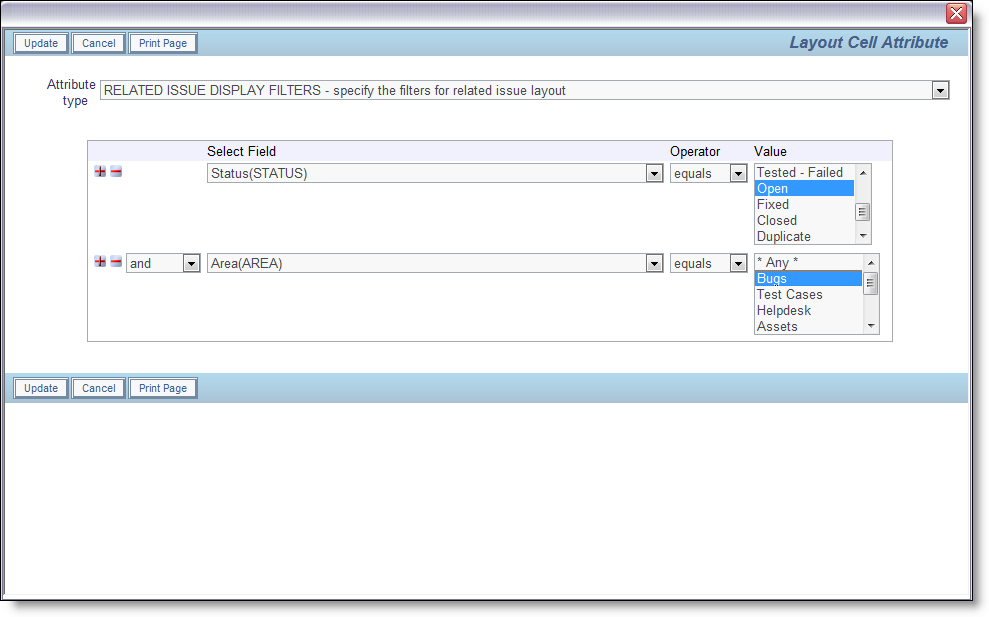
| RID FILTERS |
This attribute may only be used on a cell containing a related issue display. It allows the administrator to set one or more filters on the related issue display. For example, you might want to filter the related issues to only display the Open issues, or you may want a much more complex filter. When you select this attribute, you will a dialog similar to the following. Use the query filters to compose the expression required, then update the attribute. Note that you cannot filter on the KEYWORDS field:
Note that there are two special values in field lists:
|
||||||||||||||||||
| RID FILTER RESULTS |
This attribute is typically used in conjunction with the RID AUTOLOAD attribute on a related issue layouts that is connected to a search layout. When this is set, the rendering of the search results is modified, to place a search field above the fields on the layouts that contain text information. The user can enter text within the search field and the results within the related issue display will be filtered according to the text entered. There are some limitations on the layout that this is used with:
|
||||||||||||||||||
| RID FIX TITLES |
This attribute may only be set on Related Issue Display layouts within Add, Edit layouts, or sublayouts of these. When this attribute is used in conjunction with the HEIGHT attribute, and a scroll bar appears after issues have been added, the title to the Related Issue Display is fixed as the user scrolls.
It is not recommended that you place SIZE layout cell attributes on the fields contained within the Related Issue Display layout when you use this attribute. The best results are obtained when the browser sizes all the columns and column titles. |
||||||||||||||||||
| RID GROUP REFERENCE FIELD | If you do not use this cell attribute on the cell in a layout containing the LAYOUT.RELATED_ISSUE_DISPLAY (or other related issue layout), then ExtraView assumes that you are linking issues based upon the value in the ID field. If you have altered the behavior setting named ITEM_ID_DISPLAY to point to ALT_ID rather than ID, then issues will be related on the ALT_ID field rather than the ID field. However, you can use this entry to provide a link based upon the value of any other field on the layout. This is a very flexible feature, allowing arbitrary groups of issues to be linked, dependent upon any field. | ||||||||||||||||||
| RID LINK FIELD NAME |
This attribute is used when linking selected search results on an ADD_PROBLEM or EDIT_PROBLEM layout to a related issue display which will contain the selected records. This field is an intermediate field which will contain the ID’s of the selected records. For most purposes, this field can be hidden completely on the layout, using the following two attributes:
See the example here for use of this attribute. |
||||||||||||||||||
| RID OMIT AUTO POPULATE | Bypasses the automatic population of related issue ID’s for the field | ||||||||||||||||||
| RID ONCLICK_JS | This attribute is used on a related issue display to define JavaScript to execute when the user clicks on the RID PREHEADER ADD BUTTON. This can either be JavaScript itself, or a call to a JavaScript method in the UserJavaScript.js file. | ||||||||||||||||||
| RID PAGE SIZE | This attribute may be applied to a related issue display to override the default value in the RID_PAGING_DEFAULTS behavior setting. This value sets the number of issues displayed on a related issue display, once the count of issues exceeds the RID THRESHOLD value | ||||||||||||||||||
| RID PREHEADER |
This defines a title for the header section within a related issue display. Use this attribute on the embedded related issue display within a layout. The title will appear as shown in this screenshot:
Creating a title for related issue displays |
||||||||||||||||||
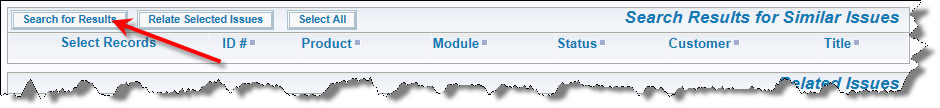
| RID PREHEADER ADD BUTTON |
Use this attribute to place an “add” button on a related issue display layout. The button must already exist before you can use this on the related issue display. The button is created within the data dictionary with these attributes:
Add button on a related issue display |
||||||||||||||||||
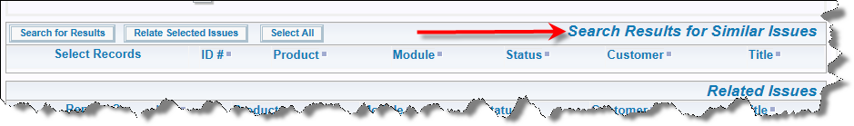
| RID PREHEADER REFRESH BUTTON |
See the example here for use of this attribute. This provides a “Refresh” button on a related issue display that contains search results. The user can select new search filters with this button to refresh the results. This attribute does not require a data dictionary field. Simply enter the title for the button that you require as the value to this attribute.
Refresh button on a related issue display |
||||||||||||||||||
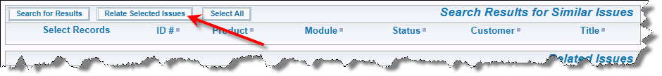
| RID PREHEADER SUBMIT BUTTON |
See the examples here and here for use of this attribute. This provides the “Submit” button on a related issue display that contains search results. The user moves the currently selected issue(s) from the related issue display to either fill fields on the current parent issue, or to relate the selected records to the current parent record. This attribute does not require a data dictionary field. Simply enter the title for the button that you require as the value to this attribute.
Submit button on a related issue display |
||||||||||||||||||
| RID RELATION TYPE |
This cell attribute defines how the related records will be displayed within the RELATED_ISSUE_DISPLAY (or other layout where the name begins with RELATED). This has four possible values:
|
||||||||||||||||||
| RID RELATIONSHIP NAME |
This attribute may only be used on a cell containing one of the following:
It will be ignored on other cells. It refers to the name of the relationship group that is to be used for the field. In case a), it defines the relationship group(s) to search for the related issues; in cases b) and c), it defines the relationship group in which the new relation is inserted. In case a), the relationship group name may be the wild-card “*”, which signifies ALL relationship groups. If you do not provide the attribute on a), ExtraView will search ALL relationship groups (as if the value were “*”); for b) and c), ExtraView will substitute the relationship group name stored in the behavior setting named RELATION_GROUP_DEFAULT, on the Workflow Settings screen. In any case, non-wild-card relationship group names must denote an existing relationship group. |
||||||||||||||||||
| RID SEARCH FILTER LAYOUT | This contains the name of the search filter layout that is used to determine the filters for an embedded layout of type Search. This is used as an attribute on the layout that will contain the results of the search, thereby linking the search filters and search results together. This example shows how this attribute is configured | ||||||||||||||||||
| RID SINGLE_SELECT | This attribute is used on a search results layout. It is used to constrain the number of results that are selected by the user to a single one, so that the fields on the selected result are returned directly into fields on the current issue. Business rules transfer the results into the fields on the current issue. The example here shows how this is configured. Note the use of the inbuilt field named RELATIONSHIP_GROUP_CHOOSE_BTN field to provide a radio-button-like function to allow the user to select the result they want to transfer. If this attribute is not set then the RELATIONSHIP_GROUP_CHOOSE_BTN field allows multiple selections, and the use case is likely to be that the entire set of results will be used to create a group of related issues | ||||||||||||||||||
| RID SORT ORDER |
In this attribute, you specify the sort order of the records presented on the RELATED_ISSUE_DISPLAY. Specifically, you can set up:
To specify ordering by more than one field, insert multiple Relationship Group Sort Order attributes. To specify where a sort order field appears in the sort priority, use the rank number. For example, two attributes may be:
As usual, the sorting is done on SORT_SEQ within the field’s definition, and then the title of the field value. You can also optionally aggregate values while grouping together values within a field, and providing sub-totals or other attributes for each group. Set the Group By field to a value of Y to enable this feature. Now you will generate subtotals as well as a grand total. Clicking on a field title at the top of the related issue display will cause a refresh of the display, change the sort order and the sub-totals |
||||||||||||||||||
| RID THRESHOLD | This overrides the setting within the behavior setting named RID_PAGING_DEFAULTS. The number in this setting defines the number of issues that must exist within the related issue display before paging of the issues is performed. | ||||||||||||||||||
| RID TRANSPOSE LAYOUT | This attribute only works in conjunction with a related issue display. When this is applied to a related issue display, it causes a transposition of the rows and columns on the related issue display. | ||||||||||||||||||
| ROW VISIBLE IF | This attribute works with EDIT_RID_ type layouts only. Set a condition in the attribute to make the issue (row) within the EDIT_RID_ visible. | ||||||||||||||||||
| SIZE |
This has two purposes, depending on the field with which this is used: 
|
||||||||||||||||||
| SPELL CHECK | Use this layout cell attribute to activate the ExtraView inbuilt spell checker for the field. | ||||||||||||||||||
| STYLE |
This sets the style of the value component of a field (not the style of the field label). This attribute is supported within add and edit layouts only. It is supported with the field in both read and write modes.
It is recommended that you add a style attribute to a field, rather than use the HTML MODIFIER attribute with a STYLE tag. This prevents the possibility of the field having two style attributes, which is invalid HTML syntax. Only one of these attributes will be recognized in the user’s browser. It is helpful if you will have a reasonable understanding of HTML tags, attributes and CSS to use this layout cell attribute. Example: You may want to display a field on a report with a background color of light blue and in bold. To achieve this, add a STYLE cell attribute of: background-color:#ddddff;font-weight:bold |
||||||||||||||||||
| STYLE IF | This attribute works similarly to the STYLE attribute, but allows a logical expression to be used to define the style only in specific circumstances that you define | ||||||||||||||||||
| SUPPRESS ALLOWED VALUES | This only applies to fields placed upon a search filter layout, such as the Quick Search, Full Search or Chart filter layouts. When this layout cell attribute is set, and the field is a child in an allowed value relationship, then the child list will not be filtered by its parent, and all possible values will be displayed. For this cell attribute to work, the parent field of the relationship must also be on the layout. | ||||||||||||||||||
| SUPRESS VALUE | This attribute only works with numeric progress bars. By default, each numeric progress bar also displays a percentage value to indicate progress. There are occasions when the administrator may only wish to display the progress bar without the percentage and setting this layout cell attribute achieves that objective. This option may be set at a global level for the field, in which case it is also recognized on report output, as well as on add and edit screens. | ||||||||||||||||||
| TEXT SEARCH OPERATOR |
This attribute only applies to fields placed upon search filter layouts, such as the Quick Search, Full Search or Chart filter layouts. It allows the administrator to define whether a user is required to enter an exact match within a text field when it is used for a query operation, or whether the user’s query is automatically set to use a contains operator. For example, consider a field named Diagnosis being placed on a search form. The values stored in issues within the database may contain a significant amount of text, and the word hypertension may appear in a subset of the issues. When the TEXT SEARCH OPERATOR is contains, all the issues that contain the word hypertension will be returned, but when the operator is set to =, only records that exactly match hypertension are returned. However, you might want to obtain an exact match when searching for a value such as the ID or ALT_ID of issues, necessitating the use of the = operator.
The default is that the search uses the contains operator. |
||||||||||||||||||
| UPDATE MAIN ISSUE |
This attribute is only available on the QUICKEDIT_BUTTON field, when it is placed within a Related Issue Display. This attribute is used when the user is inserting / altering field values on a parent issue and within a Quickedit session on a row within the Related Issue Display and the child issues update the parent issues when changes are submitted. The user may have made independent changes to values on the parent issue before the Quickedit session, and these would be lost when the child update happens, given there is a screen refresh of the parent issue at this time, and the update uses the values stored for the parent within the database, not the current values on the screen.
There is an option to Ignore Required Fields with this attribute. This allows the update to the parent issue to ignore any required fields when the child is updated and not all fields on the parent record may have been completed. The UPDATE MAIN ISSUE could not complete if required fields existed and were not filled in, but the expectation is the user will fill in these fields before completing the update to the parent issue. The entire sequence is most often configured when the Related Issue Display layout is configured with inline add capability. The button defined in the data dictionary that is placed on the preheader of the RID initiates the inline add, will use the option within its configuration to Update Parent & Refresh Entire Screen in the After Submitting Child Issue option |
||||||||||||||||||
| USER LIST DISPLAY | This attribute overrides the behavior setting USER_LIST_DISPLAY for fields with a display type of user. Valid values are POPUP and LIST, to display the user field using that format | ||||||||||||||||||
| VALIDATE HIDDEN |
Validation between tabs allows required fields on a layout in ExtraView to be validated for existence, even if they are not visibly rendered on the currently visible screen. This most often happens when you have designed screen layouts with part of the total record being displayed with different tabs being selected. The need is to validate the existence of values within fields across the entire record, not just the fields visible under the currently displayed tab. This implies that the user will most probably be making entries under several tabs on a screen, before they submit the record. To set the attribute for the entire layout, go to the layout that embeds the subsidiary (embedded) layouts. Select the field named LAYOUT.embedded_layout_name. Add the Validate Hidden layout cell attribute to this field, and all fields within the layout will be checked.
To set the attribute for any individual field(s) within the embedded layout, simply add the attribute to the field within the layout. If you place a VALIDATE_HIDDEN attribute on a layout cell that contains an embedded layout as opposed to a field, then all the fields on the embedded layout will be subject to the VALIDATE_HIDDEN logic. Note: There is an important interaction between Validate Hidden and fields that have a Visible If attribute. If a layout element has a VISIBLE_IF condition, and if the element has the VALIDATE_HIDDEN attribute, a validation between tabs must be performed. ExtraView will automatically perform this check. Note: If the Required If attribute is used within the same field as the Validate Hidden attribute, then it must be specified after the Validate Hidden attribute, so that ExtraView processes the attributes in the correct sequence. |
||||||||||||||||||
| VALUE TAG |
This allows the administrator to add a new attribute to the HTML <TD … tag that surrounds the value of the cell. This can be used to provide a different style for the value, or to inject any other valid HTML into the cell value tag. It is likely that you will need a reasonable understanding of HTML tags and attributes to use this layout cell attribute. This tag is supported on add, edit, detailed report and Quicklist layouts. |
||||||||||||||||||
| VISIBLE IF |
This is for indicating whether or not a field or embedded layout is seen depending on the value of another element, including itself. You may have more than one VISIBLE IF attribute on a field. If a field controls a hierarchy of VISIBLE IF dependencies, and it becomes invisible, all the fields below it in the dependency tree will also become invisible according to their conditions. Note that VISIBLE IF dependencies only work on fields with a display type of List. Further, they do not work if the field has been set in the data dictionary to be a multi-valued list, or if the field is a pop-up list. The VISIBLE IF attribute is only supported on layouts that are rendered within add or edit forms.
Note that if you use the greater than or less than operators, they only work with numeric comparisons. If you place a VISIBLE IF attribute on a layout cell that contains an embedded layout as opposed to a field, then all the fields on the embedded layout will be made visible or not visible, according to the conditions set with the logic of the attribute. This is the simplest method to create several embedded layouts which are to be made visible or invisible according to the selected value in a driver field. Conditional attributes such as FIELD REQUIRED and VISIBLE IF can be applied multiple times to a single field. When you use this functionality, the validation uses ‘OR’ logic. For example, you may set two VISIBLE IF rules, such as:
With this rule, the action field will be visible if (a) or (b) is true. When you use a VISIBLE IF layout cell attribute within a Related Issue Display layout, or a report layout, the field referred to as the condition for visibility must also be present on the same layout. Further, the VISIBLE_IF layout cell attribute only works on the EDIT_BUTTON, VIEW_BUTTON, DELETE_BUTTON and HISTORY_BUTTON within these layouts. |
||||||||||||||||||
| VISIBLE VALUES |
This attribute allows you to display individual values within a field which contains a list of values, hiding all others. When you select this attribute, you are presented with a list of all the values within the field, and you select the values you want to make visible. This may be used with great effect on fields such as AREA on an add layout, to constrain a user to only be able to add new issues into specific business areas, and to lock the user out from other business areas.
Note that if you configure this attribute, you may not then configure a FIELD HIDE VALUES attribute on the same field. This attribute is only supported on fields with a display type of List (including multi-value list, put not popup lists), Radio Button and Tab. |
||||||||||||||||||
| VISIBLE VALUES IF | This attribute is similar to VISIBLE VALUES, but adds the capability to only display the values based upon a logical expression based on other fields within the form. | ||||||||||||||||||
| UPDATE MAIN ISSUE |
This attribute only affects the behavior of an EDIT_BUTTON field when it is placed on a related issue display. It has no function or purpose outside of this and will be ignored as an attribute on all other fields and layouts. The purpose of this attribute is to allow control of updates of the current issue on an edit screen when you edit a related issue by clicking on an EDIT_BUTTON in the related issue display. In such circumstances there may be business rules or other logic that triggers when you update the related issue; this logic may update the current issue. Under normal circumstances this would lead to a concurrency error when the user tries to update the current issue after completing the update to the related issue. In such an event, the desired behavior is often to allow the related issue to update the current issue, and allow the user to then update the current issue, but without a warning or error. To support this, there are three possible values for the layout cell attribute. These are applied in the following order:
|
- For equals and not equals comparators, you can compare strings or numeric values
- For > and < comparators, only numeric field display types can be compared, i.e. NUMBER, DECIMAL, and CURRENCY types
Note: When adding a layout cell attribute of the types VISIBLE IF, REQUIRED IF, NOT REQUIRED IF and similar, and you are operating on a field with a display type of Checkbox, and you want to act upon the unchecked value, use a setting such as VISIBLE IF field_name NOT EQUAL Y.
Special Pseudo-Fields for “IF” Layout Cell Attributes
There are two special fields within the select list for “IF” type layout cell attributes. These are:
- SCREEN (Screen Name) – This allows you to select the values of ADD or EDIT. This allows you to determine whether the attribute is to be applied to only the Add or the Edit screen. If not used, the attribute is applied to both screens
- IS_WORKSPACE (Is Workspace) – This allows you to determine whether the attribute is to be applied within a Workspace. If not used, the layout cell attribute is applied to both the standard and the workspace interface.