
Example of a tab field
Tab fields typically segment the screen into separate areas, above and below. In general, the contents of the screen beneath a tab field will alter when you click on an entry in the field. For example, when you visit either the Add or the Edit screen, there may be sets of tabs. The screenshot in the example allows you to choose different business areas within ExtraView.
When you click on any of these tabs, the area of the screen beneath the tabs refreshes with the appropriate fields and values for the data for the tab. One usability feature is that if you have a form within a browser window that is longer than the height of the window, and you choose a different value for the tab, ExtraView will place the new embedded layout to display at the top of the screen, thereby preventing the situation where the new layout may be hidden beneath the bottom of the window.
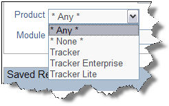 |
A list field allows you to select a single member of the list, by clicking on the entry you want to select. List fields can be stand-alone, or they can form part of a relationship, where the members of the list either alter the contents of another list (i.e. the field is a parent of another field), or the members of the list are changed by selecting a value in another list (i.e. this field is a child of another field). |
Some list fields may not have the value * None * in the list. In this case, you are being forced to select a value from the list, whether or not the field is required. The field defaults to the first value in the list which will be selected if you do not choose another value. Some list fields on add and edit screens may have the value * New * in the list. This allows you to add a new value into the field, without being an administrator. When you select * New * a window pops up, to obtain the values needed for the new entry.
 |
Popup fields are a variant of the List display type field. Popup lists are typically used for large lists where the number of entries makes a standard list difficult to search through, or visually awkward within a browser window. |
With a Popup field, you may either type in the entry for the list, or click on the icon beside the text entry box. When you click on the icon, a search window appears, allowing you to perform a wildcard search, or to drill down to the item you want to select. Click on the item to select, and its value will be placed in the field.
Popup fields may have been configured by your administrator with an auto-complete function. Auto-complete, or type-ahead as it is sometimes known, works by having one or more characters typed into the list and then automatically presenting you with the most likely matches for the value you are composing. At any time you can select a value from those presented to you by clicking on the value, or you may continue typing in characters until you complete the value. As you type, the values presented in the list are refined to further match your entry.
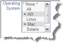 |
The multi-value field type allows you to select more than one item from a list. For example, the screen below shows two languages can be selected from a list, as indicated by the plus signs. Each item in the list is selected or deselected with a single click of the mouse. If you click on the * None * item, then the list is cleared. Note that the arrow character may be another character such as “+”. You may use a single click on a value, and then a shift key plus mouse click on another value in the list in order to be able to select a range of values in a list. |
Your administrator may have enabled an option that groups together all the selected items in a multi-valued list. If this is enabled, then the selected values are shown at the top of the list, followed by the non-selected values. The list is automatically resorted when you first display the add or the edit screen, and when the screen refreshes for any reason.
 |
Radio buttons have at least two options to choose from. You make the choice by clicking on the appropriate option. Note that the administrator of the site may have set the radio buttons to flow horizontally or vertically on the screen. |
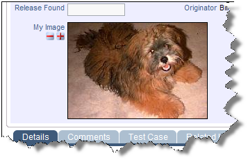 |
Image fields allow the storage of an image file inline, within an issue. When you click on the  button by the field label, a popup allows you to select the image from your computer that you want to store. Images are reduced in size for display on the screen, but you may click on the image at any time to display it in its full size. If your administrator has given you permission, you may also delete the image, using the button by the field label, a popup allows you to select the image from your computer that you want to store. Images are reduced in size for display on the screen, but you may click on the image at any time to display it in its full size. If your administrator has given you permission, you may also delete the image, using the  button. If you want to download an image field, right-click with your mouse, and use the Save-As option in your browser. button. If you want to download an image field, right-click with your mouse, and use the Save-As option in your browser. |
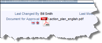 |
Document fields allow the storage of a document file inline, within an issue. When you click on the  button by the field label, a popup allows you to select the document from your computer that you want to store. Documents are shown with an icon representing its type, for example a spreadsheet or an Adobe Acrobat document. You will also see the file name of the document. To view the document, simply click on the icon or on its filename. If your administrator has given you permission, you may also delete the document, using the button by the field label, a popup allows you to select the document from your computer that you want to store. Documents are shown with an icon representing its type, for example a spreadsheet or an Adobe Acrobat document. You will also see the file name of the document. To view the document, simply click on the icon or on its filename. If your administrator has given you permission, you may also delete the document, using the  button. If you want to download a document field, right-click with your mouse, and use the Save-As option in your browser. button. If you want to download a document field, right-click with your mouse, and use the Save-As option in your browser. |
All date fields will have an adjacent “calendar"  icon. Clicking this will activate a popup a window as shown below, so that you can navigate to the correct year and month, and then click on the day you want to select.
The difference between Date and Day fields is that Date fields store the time as well as the date, and all Dates are corrected for a user’s personal time zone setting. Day fields are absolute, and are not corrected for the user’s time zone. Also, they do not have a time component.
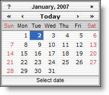 Day Calendar Popup |
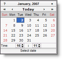 Date Calendar Popup with time |
These all store numbers of various forms, but with slight variations. Numbers are generally used for numbers where high precision is not needed. Currency fields may display the currency symbol, and thousands separators in any of the world’s currencies, as set up by your administrator. Decimal fields are set up to store numbers where there may be a large number of decimal places, and where it is important to not lose precision. All number fields can be totaled on column reports.
 User name fields can exist in several basic forms, either as a drop-down select list, where you click on the name in the list to select it, or in a pop-up select list, where ExtraView presents a list of users in a pop-up box, allowing you to drill down into the list to find the user you are looking for. Select lists may also be configured with an auto-complete option. The drop-down select lists are typically used when the list of names you are searching is of a modest number, pop-up lists can be used to search through thousands of users in an efficient manner.
Auto-complete, or type-ahead as it is sometimes known, works by having one or more characters typed into the list and then automatically presenting you with the most likely matches for the value you are composing. At any time you can select a value from those presented to you by clicking on the value, or you may continue typing in characters until you complete the value. As you type, the values presented in the list are refined to further match your entry.
If the user field has a “user list” icon, clicking this will activate the popup window. This presents a search screen where you can find the name of the user. Searching may be accomplished by knowing all or part of the Last Name, First Name or User ID. Enter as much of the name as you know, and press the Search for Account button. The window will refresh, showing the names of all the users who match the information you offered. You can use a ‘*’ as a wildcard within your search pattern.
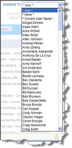 Drop-down select list |
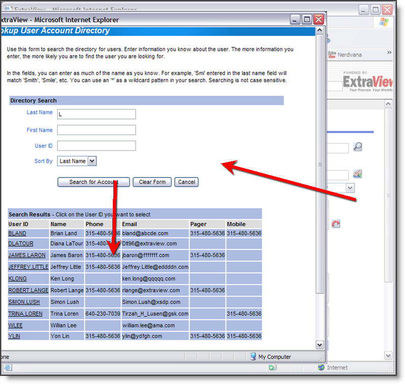 Pop-up select list |
When you see the details of the user you are searching for in the pop-up select list, click on the User ID and the name will be populated back into the screen from which you commenced the search.
A blank field value on input is considered as the same as ‘null’ or no input, and will be so treated. For example, a single blank value is not permitted in a required field.
Trailing and leading blanks are significant when adding or updating and issue, and are stored in the database as they are entered. However, you cannot search for these rows using equality on the text field. Keyword search strings are always trimmed of leading and trailing spaces. Hence, entering "abc" into a field will effectively render that field non-searchable using that text field as a filter.
Tab characters are filtered from text fields. Each tab character is replaced with a space character.
Text fields and log fields (text fields that retains previous text, and add a date and time stamp to previous entries) have two small icons  and
and  beneath their label. These allow you to shrink and grow the length of the text box, giving you a smaller or larger area in which to enter text.

Text Field
If your administrator has configured the option, when you have reached the bottom row of the text field, the field will automatically expand, offering you more space in which to enter and edit text. The text will continue to expand until the preset maximum height is reached.
A special property of text field is that if you enter a URL into the field, then when the field is rendered on a report, or the field is rendered in a read-only mode, then the URL becomes a hyperlink to the URL. For example, if you enter http://www.mycompany.com into a text field, then it will appear as http://www.mycompany.com on a report, and if you click the text, a new window will open at the address of the URL. This behavior is extended one step further. Assuming that the title for the ID field in your instance is ID #, then entering ID # 12345 into a text field, will provide a link on reports and read-only versions of the field, to the detailed report view of the issue with the ID of 12345. If the title to the ID field is Report Number, then you would enter Report Number 12345 for the same effect.
Comments (or log area) fields are similar to text fields, with a single, important difference. You may only add new comments to a field; you cannot change an existing comment. In this way, you can instantly see on the screen a log of text being accumulated as an issue is processed. Along with each entry you will see a timestamp and the user’s name that made the comment. When you are adding a new issue, there are no preexisting comments therefore the field looks identical to a text field.
If your administrator has configured the option, when you have reached the bottom row of the comment field, the field will automatically expand, offering you more space in which to enter and edit text. The text will continue to expand until the preset maximum height is reached.
A special property of text field is that if you enter a URL into the field, then when the field is rendered on a report, or the field is rendered in a read-only mode, then the URL becomes a hyperlink to the URL. For example, if you enter http://www.mycompany.com into a text field, then it will appear as http://www.mycompany.com on a report, and if you click the text, a new window will open at the address of the URL. This behavior is extended one step further. Assuming that the title for the ID field in your instance is ID #, then entering ID # 12345 into a text field, will provide a link on reports and read-only versions of the field, to the detailed report view of the issue with the ID of 12345. If the title to the ID field is Report Number, then you would enter Report Number 12345 for the same effect.
Your administrator may have configured a field on a screen to accept HTML text as it will be rendered on reports. This field type looks like this on the screen:

HTML Area field
The HTML Area utility makes use of scripts that run within the browser, and according to the security settings of your browser, you may need to acknowledge that it is OK to run these scripts.
For full information on how to use the HTML Area field type, please see Appendix B to this guide.
Checkbox fields are set with a single click of the mouse. When set, a tick mark shows in the box, when not set, the box is empty.

Example checkbox fields
You will receive an email after you add the issue, unless you have disabled this option in your personal option screen.

Email Notification section of the Add and Edit screens
Others, whose names appear in the user name fields, such as owner and assigned to, will receive email notification.
You may join the interest list for the issue by clicking on the checkbox with the label Include self on interest list. With permission granted by the administrator, you may also add others to an interest list for this issue.
You can also enter other email addresses in the CC Email field for copies of the notification to be sent to those people. These people need not be ExtraView users as long as your organization has the appropriate license for its ExtraView software.
 |
If any of the fields on the screen have a link icon, the button will link to another site, application or window within ExtraView, based on the value you enter in the field or the item you select from the list and as set up by your administrator |
 |
Some fields or groups of fields are termed as repeating fields. |
If a field is repeating, there will be a button, beneath the group of fields with a label such as Add another Release record or Add another Version record. Pressing this button allows you to add an additional value or values for the field. When you click this button, a new entry row for the repeating field(s) opens on the screen. This is typically used to break an issue into sub-issues, or to add a number of dependent data items to an issue.
Note: You may see a completely different set of fields in your installation, depending on how your system was implemented.
This field is important in most installations of ExtraView, and special rules may apply to how it functions. For example, your administrator may have determined that issues may only be moved in a particular pattern, or workflow. The administrator may also have decided that these workflow status rules are different for different user roles within your organization. For example, these are valid rules:
The status field may appear with different entries at different points within the process. For example, on the Add Issue screen, there may only be a status of new, whereas on the Edit Issue screen, there may be some combination of open, fixed and closed, depending on your role. ExtraView makes certain that users follow the process required. The status field may appear as a normal list field, or may appear as shown in the following screen shot, where a more graphical representation is used to show the status list to which you are allowed to move the issue.

Alternative Status display