ExtraView comes with a built-in navigation bar which is used for both the standard and workspace interfaces. The theme of the navigation bar is selectable, allowing you to change the graphical style and color of the buttons. Although you may change the theme of the built-in navigation bar, you may not change its functionality. Using the utility described on this page, you may create additional navigation bars for any or all user roles that the administrator has defined and use these to override the built-in navigation bar. The built-in navigation bar appears like the following screen shots, when you have selected the pale blue theme:

Built-in Standard Navigation Bar 
Built-in Workspace Navigation Bar
New navigation bars are able to be created for use by one or more user roles in your system. You may define navigation bars that have significantly more entries than the built-in navigation bar, with purpose-built buttons that control access to most ExtraView functions and with access to web pages outside of Extraview. You may also define hierarchical-style navigation bars with sub-menus being available in a traditional menu-style form.
Access to the administration utility is provided with the security permission key named CF_NAV_BAR. Note that the ADMIN user account always uses the inbuilt navigation bar, and never uses a navigation bar that you define. This prevents a situation where you design a navigation bar that inhibits access to the administrative functions, and effectively locks all users out of administration.
The administration utility that allows the definition and modification of different navigation bars is accessed through Admin --> System Configuration --> Navigation Bar. This initially takes you to a screen like this:
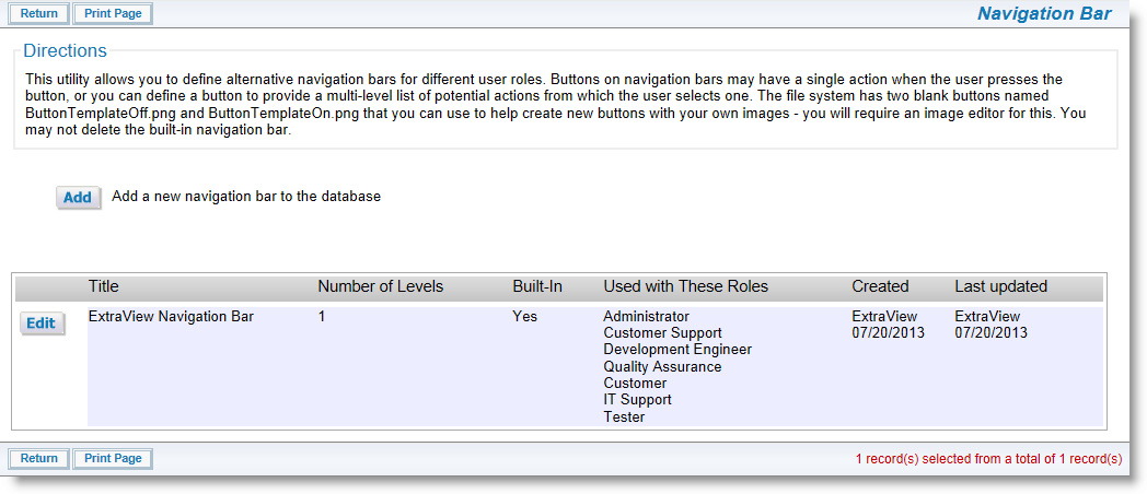
Navigation Bar Administration
The key attributes about designing your own navigation bar are as follows:
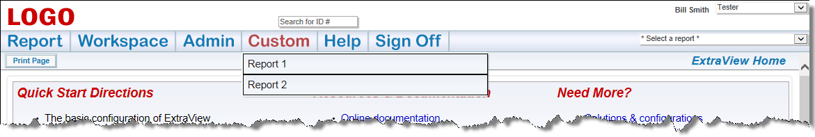
Customized Navigation Bar with Sub-Menu
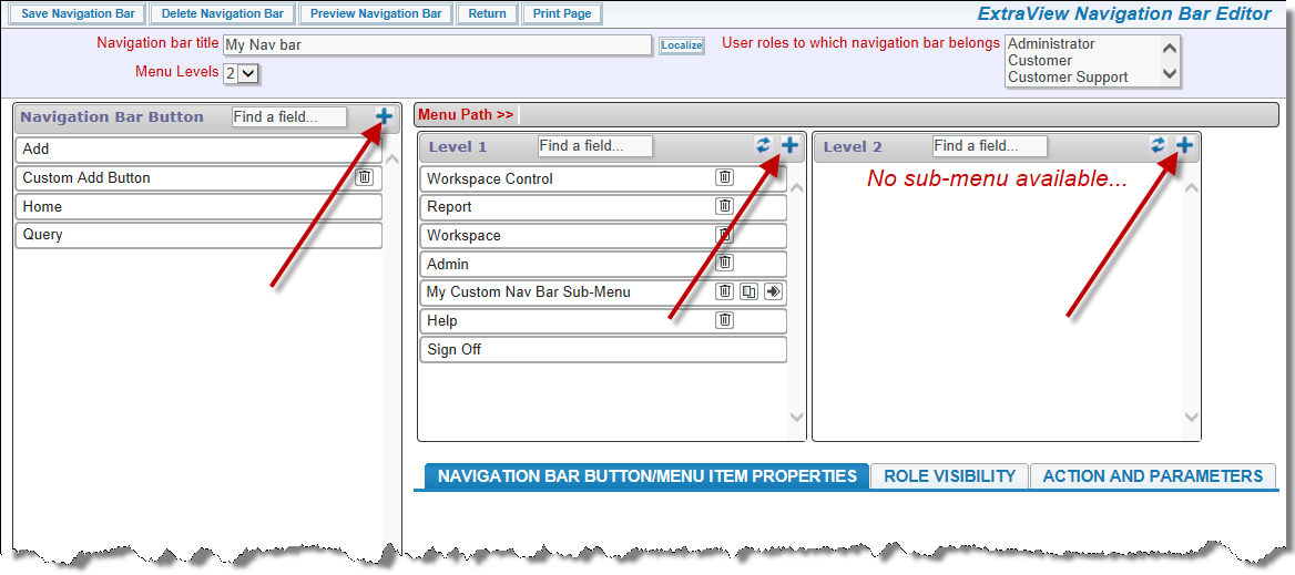
Adding a New Navigation Bar Button 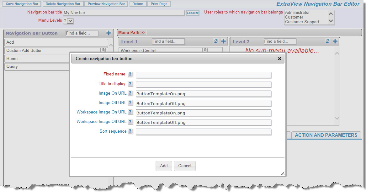
Adding a New Navigation Bar Button
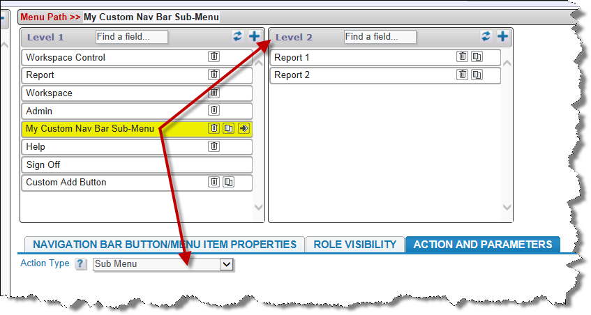
Custom Sub-Menu
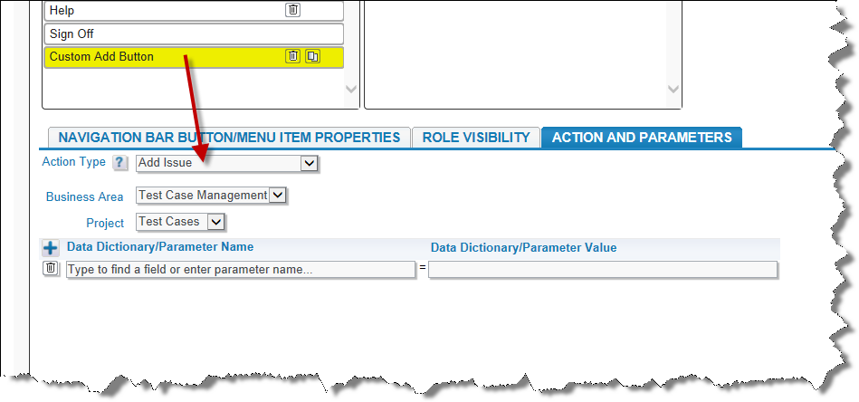
Custom Add Button
This technique only works with Add buttons on navigation bars. You can trigger a rule action using a business rule similar to this:
If the user chooses the Add Task navigation bar item, then the PRIORITY and CATEGORY fields are set as shown above.
You can control the permission to your buttons either through the utility documented on this page, or via the Grant Security Privileges administration utility.
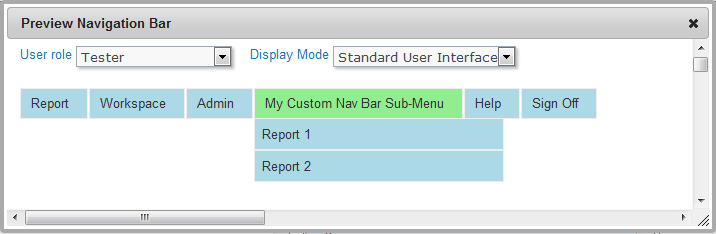
Preview Mode