Each field in ExtraView, whether it is an inbuilt field, or a user-defined field, has a display type that controls the presentation and behavior of the field, both in input mode on Add and Edit screens, as well as on output for reports. The range of Display types that can be set is as follows:
Button |
There are inbuilt fields with a display type of Button such as for View, Edit, History, Delete and Select fields. These are used on reports to provide access to the appropriate functions. These fields appear within the data dictionary under the Labels tab. There are a few other inbuilt Button fields for internal ExtraView functions. When a user clicks on a field with a display type of button, it is expected that some action will take place. These actions need to be defined with custom code within the ExtraView environment. To create a custom button, you will create a field within the data dictionary with a display type of Custom. Custom code must be defined to perform the action. Functions are available within the custom code environment to detect when a custom button is clicked and from there your code must handle the action. |
||||
Checkbox |
|
||||
Currency |
This field allows the user to enter numbers that will be displayed with the formatting seen on currency amounts, such as a currency symbol, thousands separators and decimal points. The user may choose from a list of valid currency symbols, as well as set the formatting for negative numbers and set the thousands separator. Note that the formatting information for currency fields is entered into a box that appears in the data dictionary when you select the display type of Currency from the selection list. The implementation uses a precision of 38 and scale of 10 (28 digits to the left of the decimal point and 10 digits to the right) when the value is stored in the database. If a user attempts to insert a number larger than this into a currency field, it is not possible to accurately display the number. At this point, ExtraView converts the number to a null value, and enters a message into the application log file. |
||||
Custom |
This field assumes that ExtraView’s user custom code will provide the contents and management of the field, allowing you to extend the functionality of ExtraView with new custom display objects. The field title will be rendered as normal, using the title of the object. The method call to user custom that provides the code is: ucValue = Z.userCustom.ucRenderEmbeddedObject( dbconn, session, layoutType, The returned value ucValue is a String. For fuller details on this display type, please see the User Custom Guide. However, it is worth noting here that almost any code can be generated into your layouts with this display type. |
||||
Date |
Note: Microsoft SQL Server has a limitation in that any date before 1753 is invalid and cannot be stored, and calculations based on dates before this are invalid. If your installation is running on SQL Server, this is a limitation that ExtraView cannot work around. Users who have write permission to date fields on add and edit screens and whose personal date format is set to exclude time, for example using SHORTDATE, can still enter time into a date field. The popup calendar will supply the time automatically, but the user can override this. This avoids problems between users when some are using a personal date format that contains time, while others use a personal date format that excludes time. |
||||
Day |
Note: Microsoft SQL Server has a limitation in that any date before 1753 is invalid and cannot be stored, and calculations based on dates before this are invalid. If your installation is running on SQL Server, this is a limitation that ExtraView cannot work around. |
||||
Decimal |
This allows a number with a number of decimal points to be entered and stored. The implementation uses a precision of 38 and scale of 10 (28 digits to the left of the decimal point and 10 digits to the right) when the value is stored in the database. If a user attempts to insert a number larger than this into a decimal field, it is not possible to accurately display the number. At this point, ExtraView converts the number to a null value, and enters a message into the application log file. |
||||
Document |
|
||||
HTML Area |
This display type offers the ability to enter and edit text with an HTML editor. This field will appear on the add and edit screens with a toolbar, much as you have with a word processor. On reports, the HTML within the fields is rendered, including embedded objects such as images. You can control which buttons appear on the toolbar, and the style of the toolbar with the behavior settings named EDITOR_BUTTONS and EDITOR_STYLE respectively. The row height of HTML areas throughout ExtraView is controlled with a behavior setting named HTMLAREA_ROW_HEIGHT. Each HTML Area field may store up to 5MB of data.
|
||||
Image |
|
||||
Label |
A label is used as a display item only. No data is stored in the database against any label field. Labels are given a value in the data dictionary default value field, and this is displayed on the screen in read only mode. Some inbuilt labels are also used internally within ExtraView, to provide a means of altering a term such as “problem” to be suitable for the use of ExtraView in any customer installation. Labels may be placed on layouts such as the add and edit layouts. They can be used to provide instructions to users or other information. |
||||
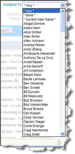
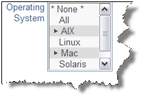
List |
|
||||
Log Area |
This field functions as a log of successive text entries to a field. Without access to the security permission key named PR_RESOLUTION.EDIT_LOGAREA_FIELDS, the user cannot edit or delete previous entries but can only add additional entries. The user’s name and a time stamp are shown against each entry. When the field can be updated, two buttons, to shrink and enlarge the text area appear adjacent to the field. There is a behavior setting named LOG_AREA_DISPLAY_CHARS in the Display Settings area of Administration. This can be used to truncate the size of the old entries displayed on the edit screen. When the field is truncated, “more…” is displayed at the end, allowing the user to refresh the screen with the entire entry. Each entry into a Log Area field may store up to 5MB of data. When there is more than one entry within a log area fields, sort icons will appear by the user's name and timestamp of the first entry. The user can use these to resort the comments in different directions. Use the LOG_AREA_INITIAL_SORT behavior setting to determine the direction of the initial presentation. Log area fields may be entered on forms and presented on existing entries and reports as rich text, when the prompt Present as HTML is set to Yes in the data dictionary definition for the field. This option is not available on log area fields which are defined for repeating rows. It is not recommended that you place log area fields on repeating record layouts. Each entry in a log area field is preceded by a header that shows a combination of the user’s name, the user’s company name, the timestamp of the comment and a sequence number for the comment. See the text for the behavior setting named LOG_AREA_TEMPLATE to adjust the presentation of log area fields. Note: If a user does not have read permission to the security permission key named PR_RESOLUTION.ASSIGNED_TO, then they will not see the name of the person who created the entry to the log area. This is useful if you want to allow customers or guests to see the comments made, but to not know who made the entry. You can make the size of the log area field auto-size to the amount of text in the field, by adding a layout cell attribute of onkeyup=autoSize(this);. This attribute will only apply to the layout within which it is set. With this attribute, the number of rows that the field occupies will increase automatically as the user enters additional text. |
||||
Number |
This is a field that accepts and stores only numbers. Numbers may have decimal points, but they must not have other formatting. The internal data type used for the NUMBER data type is double, allowing precision of approximately 16 decimal digits (0 to 9007199254740992). You cannot enter numbers larger than this, without losing precision and accuracy. |
||||
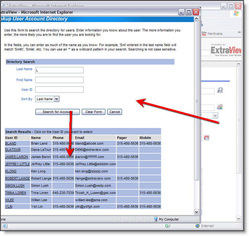
Pop-up |
|
||||
Print Text |
This is similar to the Text Area type field, but on display, a fixed-width font is used for the field. This can be used if the field may routinely be used to hold diagrams drawn with characters such as +------+ on the keyboard and you want to preserve the spatial accuracy of the diagram. Print text fields can store up to 128k of text at one time and while they are in edit mode, two buttons appear adjacent to the field, allowing you to expand or shrink the area for text entry. Text output fields to reports with a type of Print Text will preserve exactly the spacing that the field was created with, including spaces and returns in the data. This preservation of the input may cause reports such as the detailed report to display wider than normal. You can make the size of the log area field auto-size to the amount of text in the field, by adding a layout cell attribute of onkeyup=autoSize(this);. This attribute will only apply to the layout within which it is set. With this attribute, the number of rows that the field occupies will increase automatically as the user enters additional text. Each Print Text field may store up to 5MB of data. |
||||
Radio Buttons |
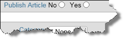
Radio buttons will use a list of values to create a set of buttons on the screen. The user can select only one value from the list when they are filling in an add or edit screen. You must create at least two values for the field to function properly. It is usual to select one value as a default value. This will be the selected value when the form is first displayed. Horizontal radio buttons are rendered across the screen on both add and edit forms. Vertical radio buttons are rendered down the screen on both add and edit forms. On query screens, the radio button will act like a single-valued list field, and the results on reports will look just like results from a single-valued list field. Like all other field types that render a list-like object, the default rendering of a radio button will include a value option of * None * in the list. However, a global attribute is automatically added to a newly created radio button, to Remove the * None * Entry from the field. You may delete this attribute if you do want a * None * entry within the field when it's displayed. Within a Quickedit session, radio buttons are rendered as list fields, as the amount of space occupied by a radio button with many values may cause navigation problems within the Quickedit session. Also, within a Quickedit session, a value of * None * is added to the list, even if there is a layout cell attribute with a value of Remove None. This ensures that the first value in the list is not selected automatically when it has no value. Radio buttons are treated as list fields internally within ExtraView, but there are very few occasions when you want the default * None * value to be displayed. Radio buttons have two ways in which they may rendered on the screen. Further, it is possible to set a "toggle" option, allowing the user to deselect a radio button, as opposed to only allowing them to select values.
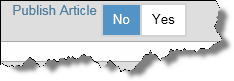
Note that when you display radio buttons on the ExtraView Mobile app, radio buttons are always displayed with the box style. Standard radio buttons are most often too small to select with a finger. |
||||
Tab |
This field behaves like fields with a display type of List, except that the list of values that is displayed as a set of tabs across the screen. Typically, this is used to provide a high-level selection on a screen, where the subsequent fields depend on the tab selected. You should not use this display type if the supporting list has more entries than fit across the screen. Example of a tab field When you create a new Tab field in the data dictionary, it is strongly recommended that you add a global attribute of REMOVE NONE, so that the * None * value does not appear on the row of tabs that are generated. If you want the Tab field to default to a specific value, you should set a default value for that tab. |
||||
Text Area |
|
||||
Text Field |
This is a single-line text field. Up to 255 characters may be stored in a Text Field. Note that you can control the width of the text box into which data is typed within each layout on which the Text field is used, using the Layout Cell Attribute named Size. EncryptionText fields may be encrypted. To achieve this, you must set up a keystore with the encryption key(s) and decide which fields are to be encrypted within the data dictionary, on a field-by-field bsais. Telephone Number Formatting of a Text FieldThere is a built-in function that can be applied to a text field to apply standard formatting for US-style telephone numbers. To enable this feature on a text field, you create either a data dictionary global attribute or a layout cell attribute with the following HTML modifier: onkeyup=formatAsPhoneNum2(this) In addition, set a layout cell attribute of SIZE = 15 to ensure the phone number is of the correct number of characters. If you create the attribute as a global attribute within the data dictionary, there is no need to add the layout cell attribute to each layout that uses the function. There is a deprecated telephone format using an HTML modifier function of formatAsPhoneNum(). This should no longer be used as it does not work within all browsers. If you require the formatting of a telephone number in a different way, or if you require the formatting of any text field in an efficient way, it is recommended that you write a user JavaScript function and call this from an HTML modifier on the field. |
||||
Time Interval |
Time interval fields are inbuilt fields only and are used to display the formatted results of measuring time in a Service Level Agreement (SLA). These fields are automatically generated and placed in the data dictionary when an SLA is created. The administrator may choose the format in which to display the time measurement on an SLA report. All the normal attributes and permissions for fields apply to time interval fields. |
||||
User |
|
||||
The data dictionary allows the administrator to make changes to the display type of fields. While these are allowable, they may have consequences if the fields are used within any business rule. For example, you may alter the display type of a field from List to Pop-up. This is a legitimate change and the rules you have written about the field will still be valid. However, for efficiency, the display information about the field is cached within ExtraView, and changing its display type will render this information out-of-date. ExtraView refreshes the rules and re-caches this information several times a day, but there will be periods when the cache has out-of-date information. If this proves to be a problem, you can simply enter the rules file and press the Update button to refresh the information immediately.
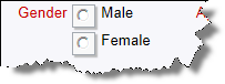
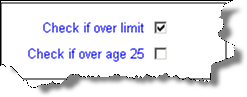 This generates a single checkbox on a screen. Apart from being able to set the title of the field, the administrator can also select the values that appear on reports according to whether the box is checked or unchecked. The default is for Y to appear if the box is checked, and N to appear if it is not checked. These values can be altered to any other titles such as Yes and No, On and Off or similar. Note that if a checkbox is never set to being checked or unchecked by a user, or is never specifically set by a default value or a rule, then the checkbox actually has a null value, and is never stored in the database. This is an important distinction, as a null value is not the same as a N value. Querying for a null value with * None *, will give different results to querying for N values.
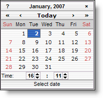 This field type allows dates and their time component to be entered and stored. The date field is automatically provided with a popup button on each add or edit screen. This button provides access to a calendar. Dates are validated against the user’s locale. For example, if your locale is US English, the date 1/5/05 is interpreted as January 5th, 2005, while if your locale is GB English, the date 1/5/05 is interpreted as May 1st, 2005. All dates are stored with a time component. When a user’s time zone is different from the time zone stored in the behavior setting named DB_TIMEZONE, the date / time a user enters is converted to its equivalent in the DB_TIMEZONE, and stored as such. For storage, all dates are further converted to UTC format. When the same user accesses and displays the date again, it is converted to his personal time zone and redisplayed. If a user is in a time zone different to the user who entered the date / time, and is in a time zone different to the DB_TIMEZONE, the date and time are converted to their personal time zone and displayed accordingly. When any user displays a Date field, the date is displayed with the user’s own personal date format. When entering a Date field, the user's locale is used to assist in validating the entry. If the user's date format begins with the day, it is assumed that dates entered will also start with the day. If the user's date format begins with the month, it is assumed that dates entered will also start with the month. This avoids ambiguity with dates such as 3/6/2012 which can be interpreted as March 6th or the 3rd June, depending on where you are located. If your application does not require time with any date you want to store, it is recommended you use the ‘Day’ display type to define the field.
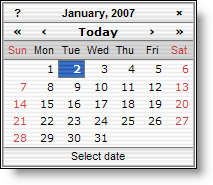 Day field types operate differently than fields with a display type of Date. Firstly, they do not have a time component, and only the date is ever displayed on a screen or report. Secondly, when a field value is input, displayed, or filtered, it is treated the same for all users in all time zones. Day field types still respect the locale and date format of the user, although no time fields will ever be shown for a Day value on reports, admin screens, or add/edit screens. If you require time as part of the field, use the ‘Date’ display type field. When entering a Day field, the user's locale is used to assist in validating the entry. If the user's date format begins with the day, it is assumed that dates entered will also start with the day. If the user's date format begins with the month, it is assumed that dates entered will also start with the month. This avoids ambiguity with dates such as 3/6/2012 which can be interpreted as March 6th or the 3rd June, depending on where you are located. Using a Day type field within a Business Rule is consistent when it is compared or combined in expressions with other Day type fields. When compared with Date fields, the Date is converted to a Day value using the user's time zone (to which the Date value is, by definition, relative) and the comparison is done with a Day field to Day field comparison or calculation. The date will be presented to each user with the date format they have selected.
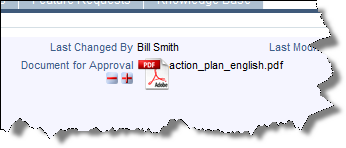 Document fields store a document of any type. For example, you might have a document that is required as part of the submission of an issue, or you may require an approver of a document to provide a signature indicating their approval of a document. Documents are represented on the screen with an icon that shows its type. For example, if the document is a spreadseet, you will see a spreadsheet icon beside its filename. Unlike attachments, documents are subject to workflow, such as being required if a condition is true, or a signature might be required indicating approval of a document that was uploaded. Document fields are only searchable with keyword searching, and only using Quickfind searching. Document fields are not searchable by default, and searching must be activated through the behavior setting named FULL_TEXT_SEARCH_COLUMNS or by updating the searchable columns on the Quickfind settings screen. When uploading a document field, the permission keys named PR_ADD_PROBLEM.ATTACH_DESC and PR_RESOLUTION.ATTACH_DESC are used to control the requiredness of the description to the document field.
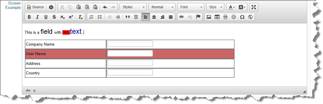
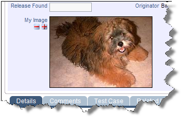 This display type allows images to be stored within issues in the database. These images appear as fields within layouts, and can be added, deleted and updated within issues like all alphanumeric field display types. Image fields may be placed on report layouts and column reports. When an image is uploaded into an issue, a thumbnail is generated and used on the add, the edit and report layouts. The size of this thumbnail is controlled by the behavior setting named THUMBNAIL_MAX_SIZE. The aspect ratio of the thumbnail will always be preserved, but the maximum number of pixels in the horizontal or vertical direction will not exceed the setting. When the user clicks on the thumbnail image, a window opens with the image being displayed in its full size. A behavior setting named MAX_IMAGE_DIMENSION_PIXELS controls the maximum dimension of any image thay may be uploaded. Images that have a height or width greater than this value will not be stored in the field. When uploading an image field, the permission keys named PR_ADD_PROBLEM.ATTACH_DESC and PR_RESOLUTION.ATTACH_DESC are used to control the requiredness of the description to the image field.
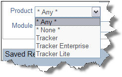
 Similar to the display type of List, except a separate popup window opens with list of possible values. The user may either type an entry directly into the field, or select a value from the list in the popup window. This field is useful if the list is long (say more than 100 entries), as it is easier to search a pop-up box. If there are more entries in the list than the number defined by the behavior setting named POPUP_LIST_SIZE, the popup list is embellished with a search box, and a list of the first characters of the data entry values (usually A – Z), to make it easy to search the list. Similar to fields with a display type of List, you can create Pop-up list fields that are aliased to a master list, reducing the amount of maintenance needed. Pop-up fields have an attribute that allows type-ahead, or auto-complete. You can set from 1 to 5 characters that are entered before triggering the presentation of the closest matches to the characters you have typed into the field.
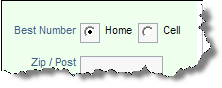
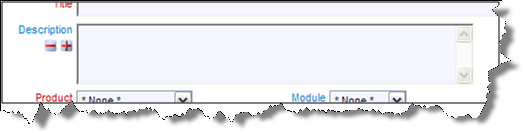 This is multi-line text field. Text area fields can store up to 128k of text. When the field is in edit mode, two buttons appear adjacent to the field, allowing you to expand or shrink the area for text entry. Note that text area fields may not contain tab characters. You can make the size of the log area field auto-size to the amount of text in the field, by adding a layout cell attribute of onkeyup=autoSize(this);. This attribute will only apply to the layout within which it is set. With this attribute, the number of rows that the field occupies will increase automatically as the user enters additional text. A behavior setting named TEXTAREA_ROW_HEIGHT allows the administrator to set the default height of all text area fields. Each Text Area field may store up to 5MB of data.