Selecting the Create new chart option from the Query / Report screen allows you to create charts of various types. Pie charts, bar charts, stacked bar, area charts and line charts can be built and displayed. Each chart you create may have filters that allow you to select what data is represented.
Note: The font used on the display of charts you prepare is set as a personal option. You can edit your personal options and choose the font you wish to use for the charts you prepare.
All charts are generated as of a specific point in time. For example, you can draw a pie chart of the status of issues within a product, as of one month ago, or you can draw a bar chart of open issues as they stood at the beginning of each month for the last year. These charts may have query filters set. For example, you may draw the chart for a specific product. The specific product used for the preparation of the chart will be the one currently stored within the issue. If this product changed within the history of the issue, the chart will not reflect this, and will report as if the issue always reported the same product. In most cases, this is sufficiently accurate, as fields outside of status that are used in the selection of filter criteria do not typically change often, if at all.
Care should be taken when selecting the filters to use for a chart, after selecting the field or fields which you are going to use for the chart itself. This matters if you choose the same field as a filter and for the chart. You might generate a chart that does not have the values you expect, by filtering out all the values.
Note: Depending on how your administrator has configured any field you select in the Select field to chart entry, may or may not be required when you are entering and updating issues. This is represented by the * None * value you see in the list. You may not want your charts to contain the * None * value. ExtraView will only place the * None * value on your chart if you explicitly include this in your list. If you choose the * Any * value, you will not see the * None * entry on your chart.
There is a button to the right of the Report Title that appears when you are editing an existing chart. When you place your mouse over this button, you will see who created the chart, who last updated the chart and the dates when these actions occured. This is most useful for managing public reports.
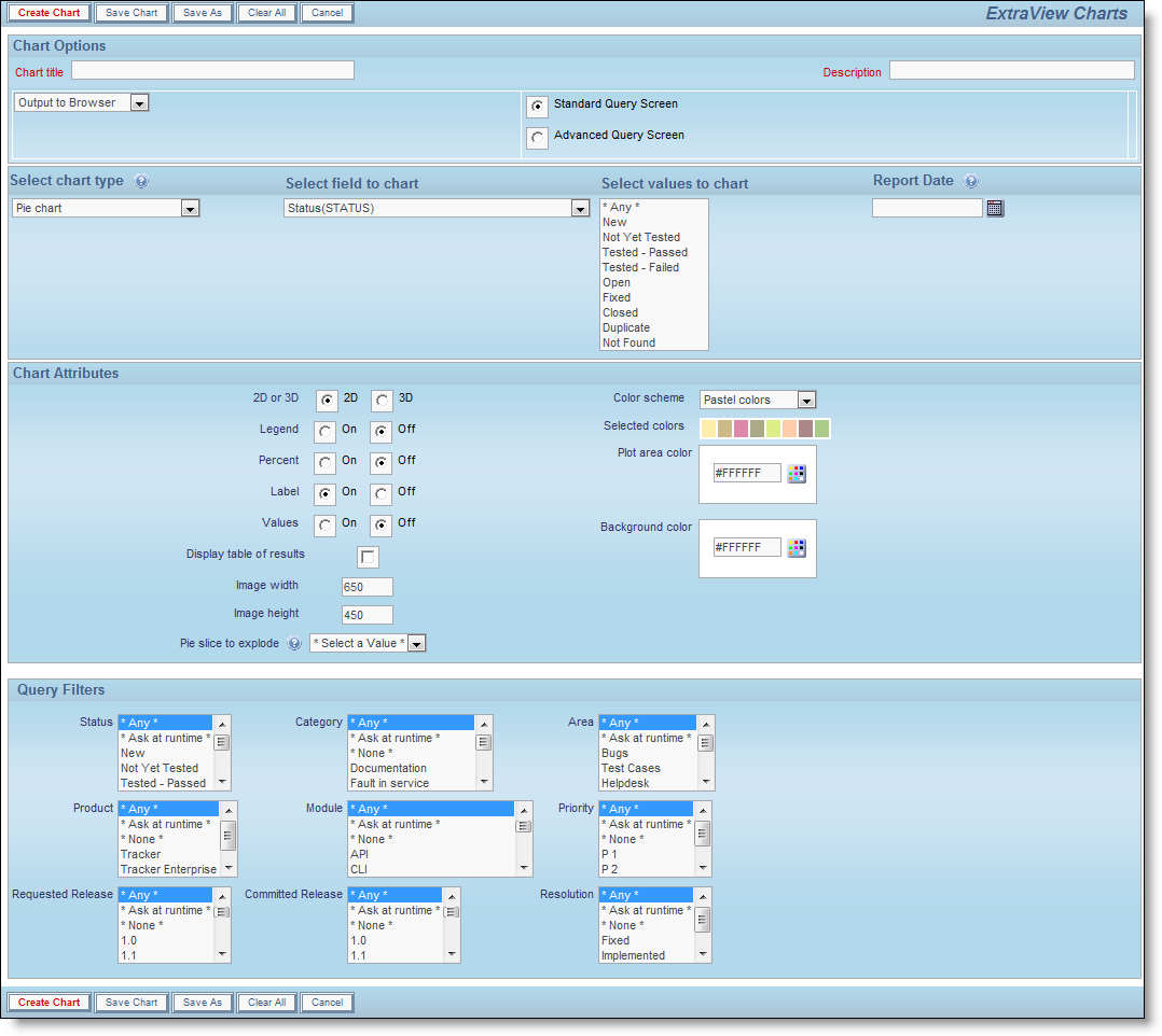
Pie Charts
After choosing the pie chart option in the Chart Options selection box, complete the remainder of the form as follows:
- Title – this will appear on the chart you prepare and also on the report screen
- Description – this appears on the report screen alongside the title to the report, once you have saved a report
- Output Option – You have a choice of outputting charts to your browser or to a PDF file
- Standard or Advanced Query Screen – Choose the type of filters you want to apply. Reporting hierarchies are only available with the Advanced Query Screen
- Select field to chart – The default selected for a new chart is to produce the output for the STATUS field. You may change this to chart any of the other fields in the list. When you change the selected field, the values for the list will appear in the Select values to chart list. Note that you can choose to chart any list or user field
- Select values to chart – this is where you select the slices that will appear on the pie chart. Use the selection box to highlight all the values or select * Any * to see all the values. * Any * is the default value.
- Report Date – Pick the date on which you want to check the statuses. ExtraView maintains a history of changes to all fields and can therefore determine the values for the chart at any point in time. If you want to set the current date, so that when you save and rerun the chart in the future, enter the value of $$SYSDAY$$. Note that a value of $$SYSDATE$$ sets the current date and time
Creating a pie chart
- Chart Attributes
- Choose the presentation options for the chart – 2D or 3D, whether to display a legend, whether to show the percentages for each slice of the pie, whether to display the labels, and whether to display the values for each slice
- If you check the box Display legend separately then the legend for the chart will not be rendered within the chart, but will be rendered to the right of the chart, in a separate area. This is useful if you have very long labels on the chart, and they overflow the size of the chart area
- If you check the box Display table of results, a table with the numeric results will accompany the chart output. For each data point on the chart, you will see its value in a table on the same page as the report
- Also selectable is the overall width and height of the chart. You are limited to charts that are a minimum of 100 pixels in width and height and a maximum of 1,600 pixels in width and height
- Also selectable is whether you wish to explode a slice of the pie chart and the overall width and height of the chart as it will be displayed on the screen
- You can select a color scheme for the chart or design your own by choosing the Custom option
- Alter the color of the plot area and the background color for the chart with the options provided. You can either type in a hexadecimal color value, or click on the color picker button to select a color from a palette
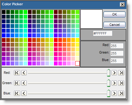
Color Picker
- Chart Filters
- You should not set a field as a filter if you have selected the field as the Select field to chart. Doing so will lead to incorrect results being displayed
- Select the filters for the report. Like other report types, you can move between the standard query filters, and the advanced query filters, using the radio buttons at the top of the screen.
- Create the chart using the Create Chart button.
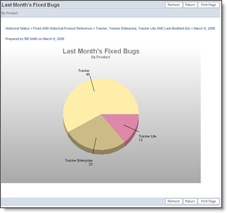
Sample Pie Chart
Time-Based Bar Charts, Stacked Bar Chart and Area Chart
Producing each of these chart types is identical, although the generated chart will be different. Choose the chart type from the selection list.
After choosing the chart option in the Chart Type selection box, complete the remainder of the form as follows:
- Provide a chart title and description
- Display cumulative results - This option allows you to determine whether to chart the values over time, by calculating and displaying the total number of items in the value, or whether to only display the number of items that moved into that value during the period. If you are charting status values, you might want to know the total number of issues within a status within a specific time period, or you may want to see only the values that moved into each status value within the period. For example, the latter type is useful if you want to see the number of new issues in a period alongside the number of issues closed in the same period
- Choose the field to be used for the chart from the list displayed. The default in this list is the Status field
- Pick the date range on which you want to plot the values. If you want to use the present date for the End date, so that when you save and rerun the chart in the future, ExtraView will produce the chart up to the current date, enter $$SYSDATE$$ into the End date field.
You can apply simple arithmetic to the dates. Only addition and subtraction are supported, allowing you to, for example, create a report with issues updated in the last week, or the last thirty days. To accomplish a chart with a date range of the last week, enter a value such as $$SYSDAY$$ - 7 into the Start date and $$SYSDAY$$ into the End date.
- You may choose increments of days, weeks, months or years for the X axis of the chart
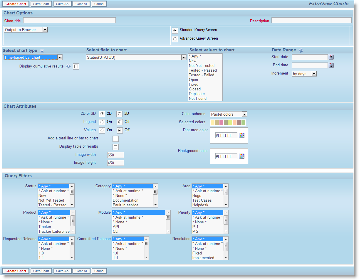
Creating a bar chart
- Chart Attributes
- Choose the presentation options for the chart – 2D or 3D, and whether to display a legend
- If you check Add a total line or bar to chart then an additional line or bar is drawn, as the total of all the other lines or bars
- If you check the box Display table of results, a table with the numeric results will accompany the chart output. For each data point on the chart, you will see its value in a table on the same page as the report
- Also selectable is the overall width and height of the chart. You are limited to charts that are a minimum of 100 pixels in width and height and a maximum of 1,600 pixels in width and height
- Also selectable is whether you wish to explode a slice of the pie chart and the overall width and height of the chart as it will be displayed on the screen
- You can select a color scheme for the chart or design your own by choosing the Custom option
- Alter the color of the plot area and the background color for the chart with the options provided. You can either type in a hexadecimal color value, or click on the color picker button to select a color from a palette
Color Picker
- Chart Filters
- Select the filters for the report, ensuring you pick at least one status. Like other report types, you can move between the standard query filters, and the advanced query filters, using the radio buttons at the top of the screen.
- Create the chart using the Create Chart button.
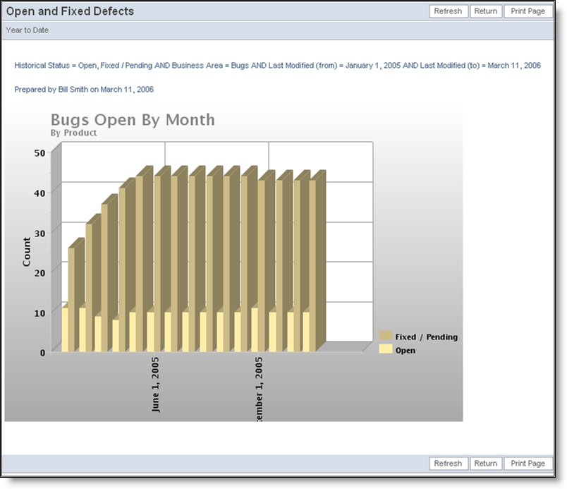
Sample Bar Chart
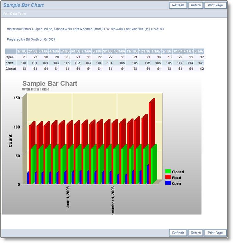
Sample Bar Chart with Data Table
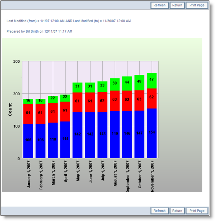
Sample stacked bar chart
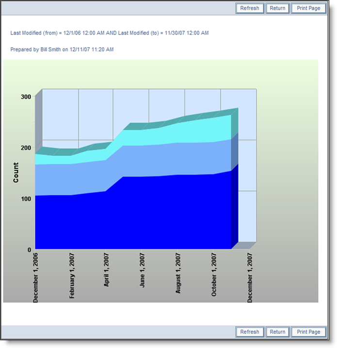
Sample area chart
Time-Based Line Charts
Creating time-based line charts is similar to creating time-based bar charts. The principal difference is that there is an additional option, allowing you to skip a number of labels on the X axis. This allows you to draw many points on the chart, but avoid having too many X axis labels that then run together.
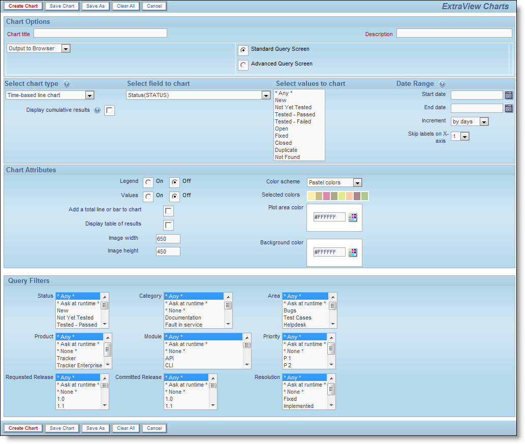
Creating a line chart
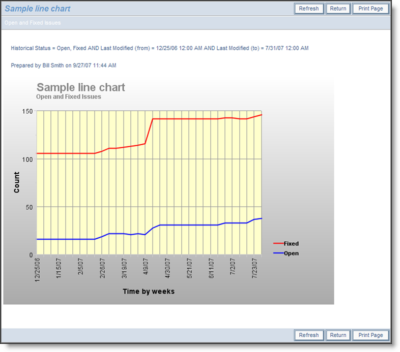
Sample Line Chart
Value-Based Charts
Value-based charts differ from time-based charts in that they take one or two fields in the database and provide a count of the number of issues across each value. For example, if you have four divisions named North, South, East and West, then a value-based chart will give a count of the issues within each of these divisions, while applying whatever filters you set.
- Value-based pie charts - choose a single field and a pie chart will be drawn of the values within the field. The attributes and filters that you can apply are the same as those for the time-based pie chart
- Value-based bar chart - choose one or two fields. If you choose a single field, a bar chart will be drawn of the values within the field on the X axis and the count on the Y axis. If you choose two values the first field is placed on the X axis and the second field is used to produce side-by-side bars. The attributes and filters that you can apply are the same as those for the time-based pie chart
- Value-based stacked bar chart - choose one or two fields. If you choose a single field, a bar chart will be drawn of the values within the field on the X axis and the count on the Y axis. If you choose two values the first field is placed on the X axis and the second field is used to produce the stacked bars. The attributes and filters that you can apply are the same as those for the time-based pie chart
- Value-based area chart - choose a single field and a chart will be drawn of the values within the field. If you choose two fields, then an area chart is drawn with the second field used to stack the values. The attributes and filters that you can apply are the same as those for the time-based pie chart
- Value-based line chart - choose a single field and a line chart will be drawn of the values within the field. If you choose two fields, then a line chart is drawn with the second field used to stack the values. The attributes and filters that you can apply are the same as those for the time-based pie chart
Charts Using Hierarchical Filters
If your administrator has defined hierarchies on which you can report, you will see an additional prompt on the chart editor screen:
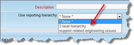
Reporting on hierarchies within charts is similar to the way they are defined for column reports. The key difference is that you are only required to select the filters for each level in the hierarchy. These filters will be applied to each level of the hierarchy for the preparation of the data to be placed on the chart. The chart output will look very similar to the standard chart you are preparing, except that the additional filters are applied.
Charts with Repeating Rows
There is currently a restriction on multi-valued fields within charting. Only one of the values for a time interval will be reported.