When selected, this action creates a report where ExtraView will a results grid with one selected field across the page and one selected field down the page. When used to count issues, this report will produce results identical to running a summary report with two selected columns, but rather than the results being displayed in a column, they are displayed in a grid form. Examples of useful matrix reports include:
When you select the option to sum issues, the same fields for the axes are used, and the same filters are applied, but you select from the list of numeric type fields presented and ExtraView will sum the values in this list.
You are able to select from any fields to which you have read permission, and which are able to be summarized and counted. For example, you can typically summarize on different values in a list, but cannot summarize on text fields.
To prepare a new Matrix report, choose the Create New Matrix Report option. The screen presented to you will be similar to the following:
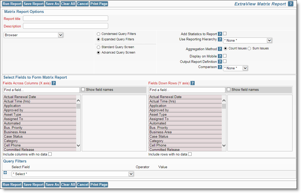
Creating a new matrix report
The following two screenshots show a matrix report with the same axes selected, Assigned To and Category. The first report shows a count of the issues within each Category that are Assigned To each user. The second report is summing the Time Spent within the issues by each of the Assigned To personnel within each Category.
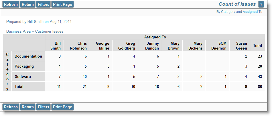
Sample matrix report counting issues
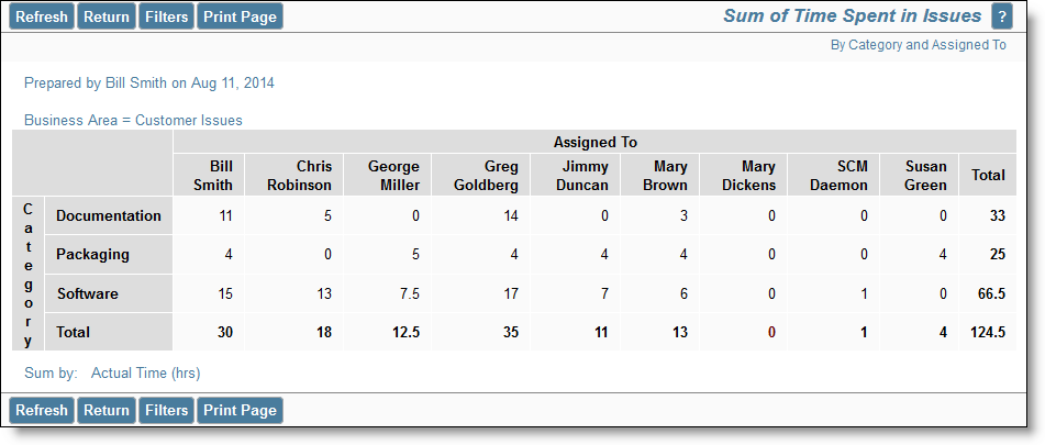
Sample matrix report summing issues
You may select up to four fields on each axis of a matrix report, and ExtraView will automatically categorize the results. As an example, here is a report with two fields on each of the axes. The X axis is displaying Category within Business Area, and the Y axis is displaying Assigned To within Status.
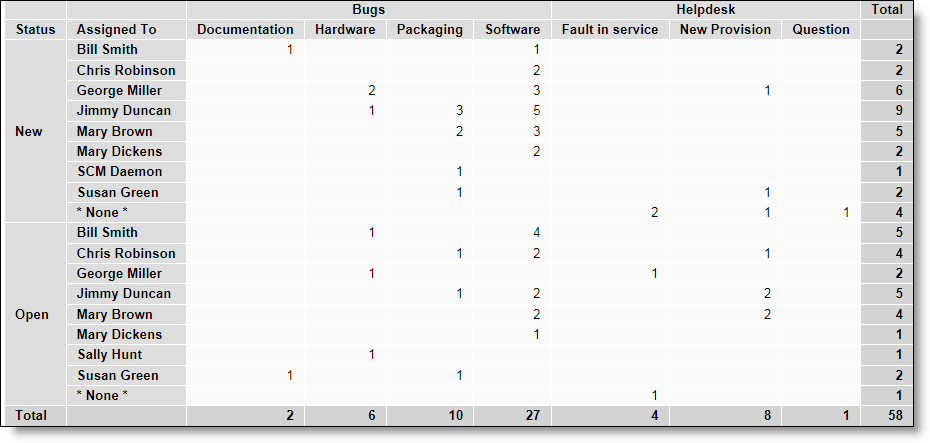
Sample matrix report with 2 fields selected for each axis
Date fields have special properties when used on matrix reports. This helps you produce a variety of time-based reports, with the date fields being used on the X axis as column headings. The key properties are:
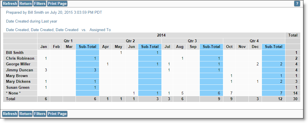
The objective is to prepare a report for last year, displaying sub-totals by quarter. The report will show the number of issues assigned to each person in each time period.
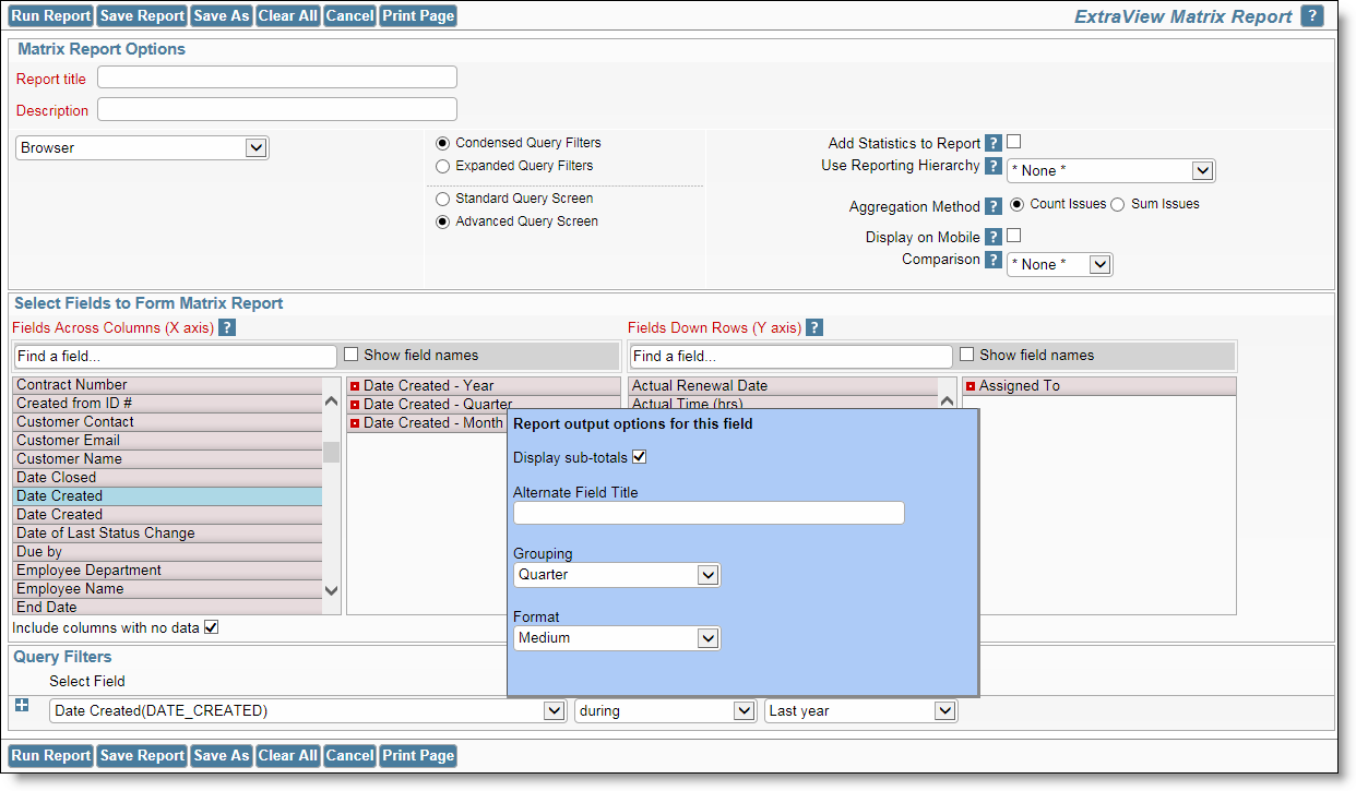
Note the following:
This produces a report similar to the output below.
The report editor screen has an option that allows you to make a comparison of the results on your matrix report with either the prior period you have selected, or with the same period in the previous year. The output will then show three sections side-by-side - the results selected, the prior results and the difference.

Notice that when making prior period comparisons, the report option to Include rows with no data is purposely enabled. This is to ensure that the same set of rows are displayed in the results and the prior results. If this did not happen, then it is entirely possible that the rows of data would not line up correctly when you view the report.
If you click on the checkbox Add Statistics to Report element on the report editor screen, you will see the percentage and the mean values for each row on the report. This may look similar to this:
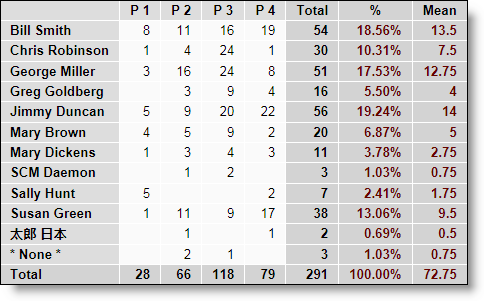
Statistics on a Matrix Report
If your administrator has defined hierarchies on which you can report, you will see an additional prompt on the report editor screen:
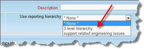
Reporting on hierarchies within matrix reports is similar to the way they are defined for column reports. The key difference is that you are only required to select the filters for each level in the hierarchy. These filters will be applied to each level of the hierarchy for the preparation of the data to be placed on the report. The report output will look very similar to a standard matrix report, except that the additional filters are applied.