Selecting the Create new chart option from the Query / Report screen allows you to create charts of various types. Pie charts, bar charts, stacked bar, area charts and line charts can be built and displayed. Each chart you create may have filters that allow you to select what data is represented.
Note: The font used on the display of charts you prepare is set as a personal option. You can edit your personal options and choose the font you wish to use for the charts you prepare.
All charts are generated as of a specific point in time. For example, you can draw a pie chart of the status of issues within a product, as of one month ago, or you can draw a bar chart of open issues as they stood at the beginning of each month for the last year. These charts may have query filters set. For example, you may draw the chart for a specific product. The specific product used for the preparation of the chart will be the one currently stored within the issue. If this product changed within the history of the issue, the chart will not reflect this, and will report as if the issue always reported the same product. In most cases, this is sufficiently accurate, as fields outside of status that are used in the selection of filter criteria do not typically change often, if at all.
Care should be taken when selecting the filters to use for a chart, after selecting the field or fields which you are going to use for the chart itself. This matters if you choose the same field as a filter and for the chart. You might generate a chart that does not have the values you expect, by filtering out all the values.
Note: Depending on how your administrator has configured any field you select in the Select field to chart entry, may or may not be required when you are entering and updating issues. This is represented by the * None * value you see in the list. You may not want your charts to contain the * None * value. ExtraView will only place the * None * value on your chart if you explicitly include this in your list. If you choose the * Any * value, you will not see the * None * entry on your chart.
There is a button to the right of the Report Title that appears when you are editing an existing chart. When you place your mouse over this button, you will see who created the chart, who last updated the chart and the dates when these actions occured. This is most useful for managing public reports.
Common Chart Attributes and Filters
Most attributes are common across all chart types that you can create. However, some attributes do not appear on all report types as they have no context.
-
Chart Attributes
-
You may choose a reporting hierarchy. If you do, you will be able to set report filters for each level of the hierarchy. Reporting on hierarchies within charts is similar to the way they are defined for column reports. The key difference is that you are only required to select the filters for each level in the hierarchy. These filters will be applied to each level of the hierarchy for the preparation of the data to be placed on the chart. The chart output will look very similar to the standard chart you are preparing, except that the additional filters are applied
-
There is an option to display the chart on mobile devices
-
There is an option to output the chart fields and filters definition along with the chart
-
Choose the presentation options for the chart – 2D or 3D, whether to display a legend, whether to show the percentages for each slice of the pie, whether to display the labels, and whether to display the values for each slice
-
If you have chosen to create a chart with a time series on the X axis, then there will be an option to select the Date format for the labels on the chart. The default will be your own date format, but you may choose a different format. The key use of this is to shorten the length of the labels on the charts you create.
-
If you check the box Display legend separately then the legend for the chart will not be rendered within the chart, but will be rendered to the right of the chart, in a separate area. This is useful if you have very long labels on the chart, and they overflow the size of the chart area
-
If you check the box Display table of results, a table with the numeric results will accompany the chart output. For each data point on the chart, you will see its value in a table on the same page as the report
-
For many chart types you can add a drilldown link. When the user clicks on the segment of the chart, a Quicklist is prepared with the issues that formed the chart segment
-
Value-based charts with field names on the X axis have an option to display the titles horizontally, vertically or at a 45° slant
-
Also selectable is the overall width and height of the chart. You are limited to charts that are a minimum of 100 pixels in width and height and a maximum of 1,600 pixels in width and height
-
For pie charts, you can explode a slice of the chart
-
There is an option to display the table of results along with the chart
-
You can select a color scheme for the chart or design your own by choosing the Custom option
-
Alter the color of the plot area and the background color for the chart with the options provided. You can either type in a hexadecimal color value, or click on the color picker button to select a color from a palette
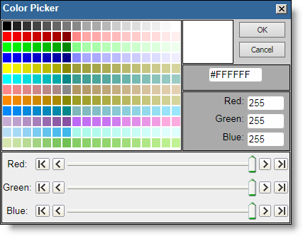
Color Picker
-
Chart Filters
-
You should not set a field as a filter if you have selected the same field as the Select field to chart. Doing so will lead to incorrect results being displayed
-
Select the filters for the report. Like other report types, you can move between the standard query filters, and the advanced query filters, using the radio buttons at the top of the screen.
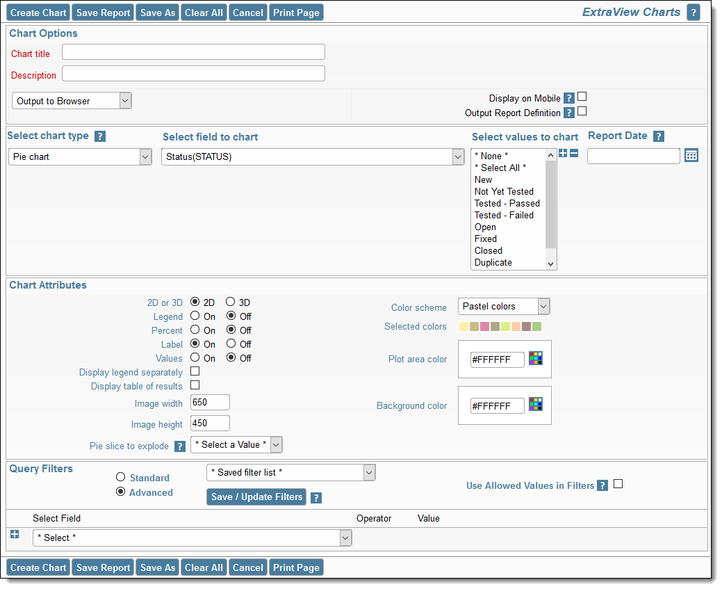
After choosing the pie chart option a typical report editor screen looks like this:
Charts with Repeating Rows
There is currently a restriction on multi-valued fields within charting. Only one of the values for a time interval will be reported.