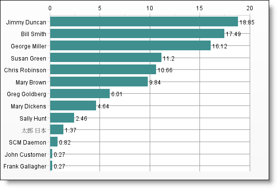
Pareto charts plot a single enumerated list field, providing a count of the number of issues within each value, from high to low. You can select the maximum number of values to plot before lumping the rest of the values in an Other category.
A sample pareto chart display looks like the following: